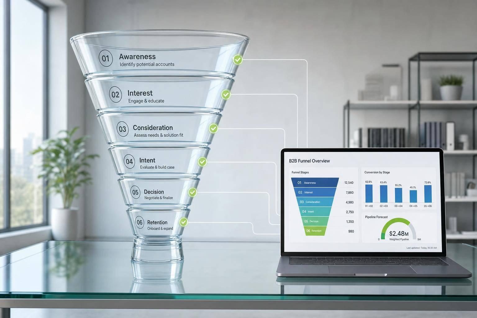
If I need one fast rule, it’s this: match the layout to the funnel stage.
I’d use pyramid for top-of-funnel reach, step flow for stage-by-stage drop-off, loop for repeat post-sale activity, and stacked bars for stage totals and segment mix.
B2B buyers often consume 3 to 7 pieces of content before speaking with sales. So the layout matters. The wrong one can hide the point. The right one makes the story clear in seconds.
Here’s the short version:
- Pyramid = best when I want to show reach narrowing to conversion
- Step flow = best when I want to show a clear sequence from stage to stage
- Loop = best when I want to show retention, renewal, and repeat behavior
- Stacked bars = best when I want to show totals, revenue, and segment mix by stage
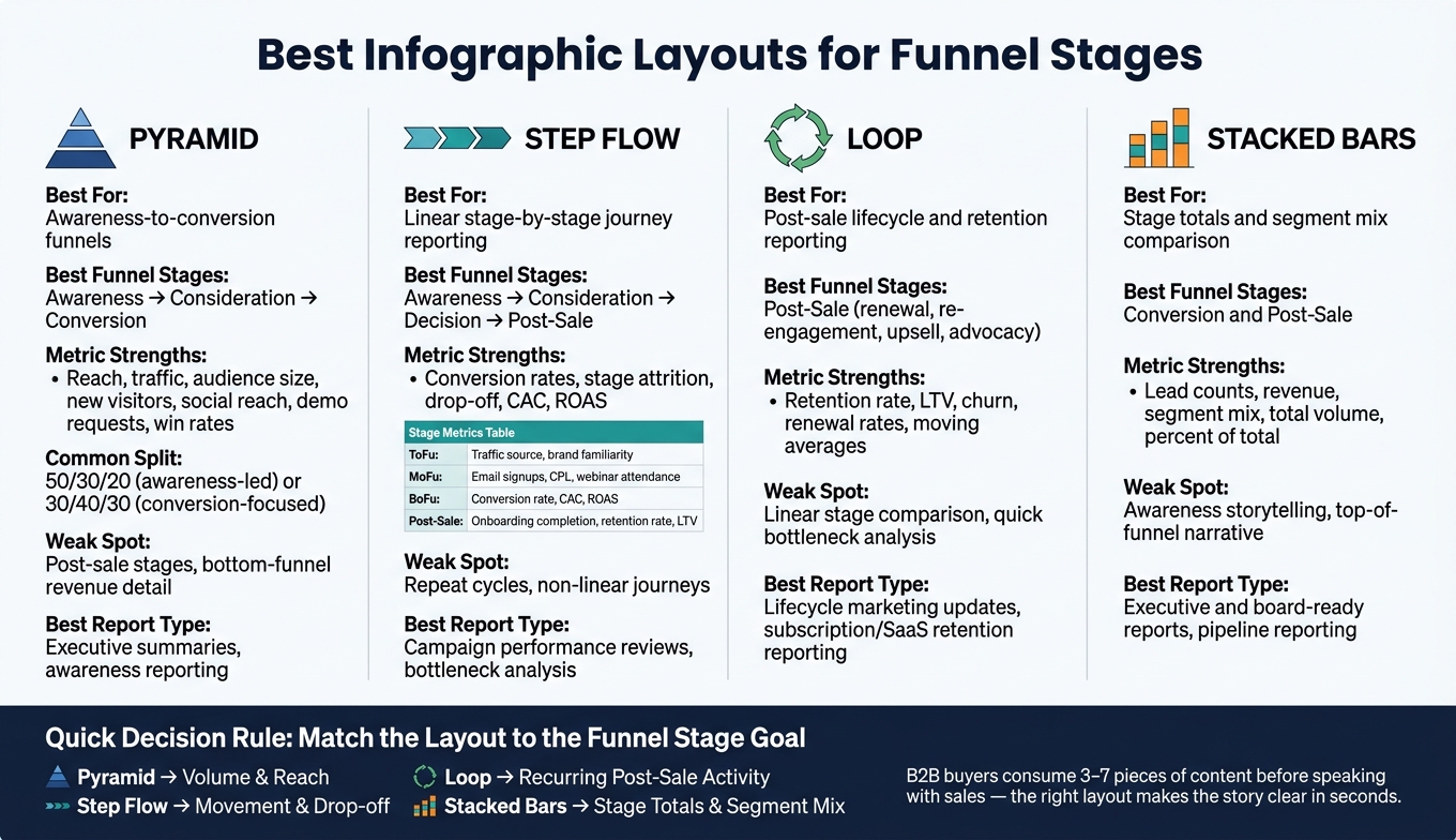
Funnel Stage Infographic Layouts: Which One to Use & When
🚀 AIDA Funnel Infographic in PowerPoint | Professional Marketing Funnel PPT Design Tutorial
sbb-itb-a84ebc4
Quick Comparison
| Layout | Best Use | Best Funnel Stages | What It Shows Best | Main Weak Spot |
|---|---|---|---|---|
| Pyramid | Reach-focused funnel view | Awareness to conversion | Audience size, top-vs-bottom funnel shape | Weak for post-sale stages |
| Step flow | Linear journey reporting | Awareness, consideration, conversion, post-sale | Drop-off, conversion rate, stage changes | Weak for repeat cycles |
| Loop | Lifecycle and retention reporting | Post-sale | Renewal, re-engagement, churn, LTV | Weak for straight stage comparison |
| Stacked bars | Stage totals and mix reporting | Conversion and post-sale | Volume, revenue, segment mix | Weak for awareness storytelling |
What this comes down to is simple: use the visual that matches the question you need to answer, often using marketing funnel software to track these metrics. If I’m showing movement, I’d pick step flow or loop. If I’m showing volume by stage, I’d pick pyramid or stacked bars.
1. Pyramid layout
Best stage fit
The pyramid works best for an awareness-to-conversion funnel. At the wide top, you have awareness. In the middle, consideration. At the narrow tip, conversion.
A common split is 50/30/20 for awareness-led teams and 30/40/30 when conversion is the main goal.
Progression
This layout makes one thing easy to see: reach vs. intent.
The top usually holds reach content, like blog posts and social media, often found in top marketing funnels. The middle is for evaluation content. The tip is where high-intent assets sit. That structure also makes content gaps hard to miss. If you have a lot of TOFU but not much MOFU or BOFU, the pyramid shows it right away.
Metrics
The pyramid is strong when you want to report on volume. The top can track attraction metrics like new visitors and social reach. The bottom can track conversion metrics like demo requests, pipeline revenue, and win rates.
That makes it a good fit for conversion reporting. It’s less useful for lifecycle reporting, since the model is built to narrow toward the sale.
Post-sale fit
The pyramid stops at conversion, so it doesn’t naturally show onboarding, retention, upsell, or advocacy. If post-sale stages matter, use a layout that gives those stages equal space.
2. Step flow layout
Stage fit
Step flow works best when the journey moves in a straight line and each stage changes in a clear, measurable way. It fits awareness, consideration, conversion, and post-sale as a sequence. If the journey circles back into repeat use or advocacy, a loop layout is the better fit.
Progression clarity
Each stage sits in its own separate block, usually a rectangle or trapezoid, which makes the layout easy to scan and compare. You can see where people move forward, where they stall, and where sharp drop-offs happen between one stage and the next. That makes step flow a good choice for stage-by-stage reporting.
Data expression
Use each block to show the metric that matters most at that stage:
| Funnel Stage | Metrics to Show |
|---|---|
| Awareness (ToFu) | Traffic source, brand familiarity |
| Consideration (MoFu) | Email signups, cost per lead, webinar attendance |
| Decision (BoFu) | Conversion rate, CAC, ROAS |
| Post-Sale | Onboarding completion, retention rate, LTV |
Post-sale visibility
Step flow is a good match for subscription and membership funnels because it can show onboarding, recurring billing, and retention in one linear sequence. For SaaS teams, adding an onboarding step can show whether trial users actually engage with the product before their first payment, which can cut early-stage churn.
Use step flow only when the journey has a clear start and end point. If the story repeats instead of ending, switch to a loop layout.
3. Loop layout
Stage fit
The loop layout works best for post-sale journeys that keep going after the first purchase. Use it for retention, re-engagement, upgrades, and advocacy when the customer story repeats instead of stopping at conversion. That makes it the best fit when post-sale activity matters just as much as acquisition.
Progression clarity
A loop makes it easy to see how customers move through recurring stages over time. You can spot where people drop off in the middle of the cycle, not just where they fail to convert at the start.
Data expression
Use summary metrics like percent of total or moving averages to show how engagement changes across the cycle.
Post-sale visibility
The loop layout is a strong way to track post-sale behavior across recurring lifecycle stages. It keeps onboarding, renewal, and expansion in one connected view without forcing everything into a straight line.
If you need one view for repeatable stage-by-stage reporting using a free sales funnels tool, the loop fits better than a linear layout. If the funnel needs stage-by-stage totals instead of recurring movement, stacked bars are the better fit.
4. Stacked bars layout
The loop layout is good at showing repeated movement. Stacked bars do something else. They put the focus on stage totals and segment mix.
Stage fit
Use stacked bars when you want to compare one stage against another, not trace movement through the journey.
They work well for multi-step funnels with clear stage boundaries, like sales pipelines from lead generation to close or lifecycle reporting from onboarding to renewal. This layout fits conversion and post-sale reporting best. It’s weak for awareness, so skip it for top-of-funnel storytelling.
That makes stacked bars better for comparison than narration.
Progression clarity
Rectangular blocks make bottlenecks and stage imbalance easy to spot.
Data expression
Stacked bars show total volume and segment mix in the same view. Distinct colors help separate dimensions, and percent of total makes proportional contribution easier to read.
Post-sale visibility
Stacked bars also work well for post-sale reporting, where onboarding, adoption, renewal, and expansion need to show up as stage totals with segment mix. For executive reporting, this layout shows both total volume and small shifts in segment mix without hiding the stage structure.
Use this layout when the question is how much each stage contributes, not how the buyer moves.
Side-by-Side Comparison by Decision Factors
The main question is simple: which layout fits the message? To answer that, you need to optimize your marketing funnels based on specific goals. A fast way to decide is to use four filters - progression, metrics, visual weight, and reporting purpose.
How each layout shows funnel progression
Pyramid and step flow both show a linear path, but they tell that story in different ways. The pyramid shows a shrinking audience - a large starting group narrowing toward conversion. Step flow breaks the funnel into clear stages, which makes the drop from one stage to the next much easier to see. That also makes bottlenecks easier to spot.
Loop works better when movement repeats instead of ending at a final stage. That makes it a stronger fit for post-sale reporting. Stacked bars do something else entirely. They don't focus on the story of movement. Instead, they put the spotlight on comparing stages and segments.
That choice affects which metrics each layout can show clearly.
How each layout handles metrics
Step flow works best for conversion rates and stage attrition. Pyramid is strongest for reach and volume, but it starts to lose clarity at the bottom of the funnel. Loop is better for recurring metrics like retention rate and lifetime value. Stacked bars are strongest when you need to show lead counts, revenue, and segment mix in one view.
| Layout | Metric Strength | Least Suited For |
|---|---|---|
| Pyramid | Reach, traffic, audience size | Bottom-of-funnel revenue detail |
| Step Flow | Conversion rates, stage attrition | Repeat-cycle data |
| Loop | Retention %, LTV, churn | Linear stage comparison |
| Stacked Bars | Revenue, lead counts, segment mix | Simple top-of-funnel storytelling |
Metric fit also affects how much attention each layout gives to the top versus the bottom of the funnel.
Visual weight across early-stage and late-stage activity
Visual weight matters more than people think. It shapes what stands out first.
The pyramid puts most of the visual weight on the awareness stage by design, so it's useful when the goal is to stress reach. The downside is clear: late-stage conversion data can look small by comparison. Step flow spreads visual weight more evenly across stages. Loop naturally pulls attention toward post-sale cycles, which helps retention feel like part of the main story instead of a side note. Stacked bars tone down early-stage emphasis but keep late-stage results easy to see.
Best fit for executive, campaign, and lifecycle reporting
Each format has a clear home.
- Pyramid fits awareness summaries.
- Step flow fits campaign performance reviews and bottleneck analysis, especially when the team needs to see exactly where leads are dropping off.
- Loop belongs in lifecycle marketing updates and retention reporting, especially for subscription businesses.
- Stacked bars are the best fit for executive and board-ready reports when you need to show volume, revenue, and segment shifts without losing the funnel structure.
Pros and Cons of Each Layout
The comparison above shows where each layout fits. Here, the focus is on the tradeoff behind each choice.
The pyramid is the most polished layout for awareness-to-conversion reporting, but it takes custom chart construction and can hide bottom-funnel detail.
Step flow is the easiest to build and read for stage-by-stage campaign reporting, but it looks less polished and can feel fragmented if the stages do not connect cleanly.
The loop works well for post-sale and lifecycle reporting, but it is slower to scan and weaker for quick bottleneck analysis.
Stacked bars show stage totals and segment mix in one view for conversion and post-sale mix analysis, but they get hard to scan when labels or segments crowd the chart.
Use the table below to scan the tradeoff at a glance.
| Layout | Strength | Limitation |
|---|---|---|
| Pyramid | Most polished layout for executive reporting | Requires custom chart construction; can hide bottom-funnel detail |
| Step Flow | Easiest to build and read | Less polished; can feel fragmented if stages do not connect |
| Loop | Fits post-sale and lifecycle reporting | Slower to scan; weaker for quick bottleneck analysis |
| Stacked Bars | Shows stage totals and segment mix in one view | Hard to scan when labels or segments crowd the chart |
Conclusion
Use the stage goal to pick the visual. That comes first. Not the chart type.
Pyramid works best for awareness. Step flow works for consideration. Stacked bars work for conversion and post-sale reporting. Loop works for recurring post-sale activity.
Match the layout to the intent of the stage, not just the data you have.
For executive decks, pyramid and stacked bars are the easiest to scan. For campaign and lifecycle reporting, step flow and loop do a better job of showing movement and drop-off.
FAQs
How do I choose the right layout fast?
Pick the chart type based on what you want to show. Use funnel charts to map the step-by-step customer journey and find drop-offs. For clean side-by-side comparisons, use bar or column charts.
Keep the chart tight and easy to read:
- Limit the funnel to 5 to 7 stages
- Put stages in chronological order
- Use clear, action-based labels
- Show both counts and percentages
- Keep colors simple so major bottlenecks stand out
Can one infographic cover the full funnel?
Usually, no. Each funnel stage calls for its own visuals and message, so infographics tend to work best when you shape them for a single stage - like awareness or consideration.
If you need to show the full funnel, use dedicated funnel charts instead. They lay out the journey step by step and make it easier to spot drop-offs and bottlenecks.
Which layout is best for board reporting?
It depends on the reporting goal.
Funnel charts with narrowing bars work well in executive presentations because they show conversion rates across each stage and make drop-offs easy to see at a glance.
For more exact side-by-side stage comparisons, bar graphs are the better pick. And for general marketing reports that focus on percentages, waffle charts are a clear, engaging choice for non-technical audiences.