A funnel chart should answer 3 questions in seconds: where people enter, where the biggest loss happens, and what step needs work first.
If I were summarizing this article in plain English, I’d put it like this: keep the funnel in the true step order, use clear labels, match segment size to the numbers, keep color and spacing simple, show both counts and percentages, and don’t cram in too many stages. The article also points out one key benchmark: keeping a funnel to 5 to 7 stages makes it easier to scan.
Here’s the short version:
- Put stages in the actual journey order
- Use direct labels like "Trial Started" instead of vague names
- Scale segment size to data, not to a generic funnel shape
- Use one neutral color and one accent color for the main problem area
- Keep spacing even so layout does not fake meaning
- Show counts and percentages together
- Limit the number of stages and move extra detail into a table or drill-down
One useful point stands out: a stage can look bad in count or in rate - and those are not always the same thing. For example, a step might lose the most people by volume, while another step has the weakest conversion rate, such as 10% vs. other steps at 25% to 30%. That’s why showing both numbers matters.
| Rule | What I’d do |
|---|---|
| Stage order | Match the true customer path |
| Labels | Use exact, action-based names |
| Segment size | Tie width or bar length to actual values |
| Color | Use color only to point at the main drop-off |
| Spacing | Keep gaps and label placement consistent |
| Metrics | Show both counts and percentages |
| Stage count | Keep the main view to 5-7 stages |
The article’s main idea is simple: a funnel chart is not just a shape - it is a reading tool. If people have to stop and figure it out, the design is doing too much.
How a data storyteller transforms a FUNNEL CHART | EP.5 Where are your eyes drawn?
1. Follow the Real Stage Order
Stages need to appear in the same order prospects move through them. That way, readers can scan the funnel from top to bottom and grasp the story right away. No stopping. No backtracking. No confusion.
When the stages match the actual customer journey, the funnel reads like a clear sequence instead of a shuffled set of labels. Scrambled stages slow people down and make the flow harder to follow.
A fixed order helps with comparison, too. Stage-to-stage conversion rates are easier to read when every step stays in the same place. That makes weak spots stand out faster.
Keep funnels to 5 to 7 stages. Add too many, and bottlenecks get harder to see.
Once the order is set, the next job is to name each stage clearly.
2. Write Clear, Descriptive Stage Labels
Vague labels make funnel reads slower. Action-based labels like "Trial Started" or "Lead Scoring Qualified" tell you what happened at each step, not just where a prospect sits in the journey. Generic labels create extra work because people have to stop and look up what each stage means. Use one shared definition across sales and marketing so funnel data stays consistent.
Clear labels also make drop-off easier to spot. When stage names are precise, MQL-to-SQL drop-off stands out right away and shows where prospects fall out. When labels are too broad, bottlenecks get lumped together, and analysis slows down.
Once labels are clear, the next move is to make sure each segment size reflects its value.
3. Size Segments in Proportion to Their Values
Once each stage has a clear name, make its size match the data. Each segment should reflect its actual value, so the funnel shows real drop-off instead of a generic funnel shape. That makes losses between stages much easier to compare and keeps the chart honest about where prospects leave.
Before you size the funnel, clean the data. If the data is off, the chart will misread the drop-off. When segment size matches value, the biggest losses stand out right away, and it becomes much clearer where users exited.
Once size lines up with value, keep color and spacing just as restrained.
4. Use Color Sparingly and Consistently
Once segment size shows value, color should do one job: direct attention. That’s it.
It’s easy to overdo color in a funnel chart. When every stage has its own shade, readers have to stop and decode the chart instead of just reading it from top to bottom. A better approach is to use one neutral color for most of the funnel, then bring in color only when you want people to notice something.
Use color to guide attention, not as decoration.
Drop-Off Visibility
Color works best when it points to the drop-off that matters most. Use a single accent color to highlight the stage where the decline is most severe, and keep the rest of the funnel in a neutral base color.
That contrast makes the problem area stand out right away without turning the full chart into noise.
Readability
Keep fonts and backgrounds neutral so the stage colors stand out. And stick with the same color scheme across reports. When teams see the same color logic each time, they can compare funnels with less friction.
Once color is consistent, spacing should be consistent too.
sbb-itb-a84ebc4
5. Keep Spacing Even and Consistent
Spacing can look like a small design choice. It isn't. It shapes how people read your funnel.
When the gaps between stages are uneven, readers can start treating the layout like data. That's where mistakes creep in. Even spacing keeps the chart honest. Uneven spacing can make the design itself look meaningful when it shouldn't.
Scan Speed
Even spacing gives the funnel a steady visual rhythm. That helps readers move through it fast and see where the funnel narrows without stopping to decode the layout.
Data Accuracy
Uneven gaps can make drop-offs seem bigger or smaller than they are. In other words, spacing should never suggest meaning that the data doesn't support.
Drop-Off Visibility
Keep label placement the same for every gap. That makes drop-off counts and percentages easier to compare from one stage to the next.
Use alignment tools instead of placing elements by hand to keep spacing even.
With spacing in place, the next rule is to show drop-offs with both counts and percentages.
6. Show Drop-Offs with Both Counts and Percentages
Once your labels and spacing are clear, show each drop-off with both volume and rate.
Counts show scale. Percentages show efficiency. Put them together, and you can spot two different problems at once: where the biggest losses happen and where the funnel is underperforming.
That makes it much easier to see which stage needs attention first.
Show both metrics at each stage so readers can compare the size and rate of every drop-off right away.
7. Limit the Funnel to a Workable Number of Stages
Once you've ordered, labeled, sized, and spaced the stages, cut the funnel down to ONLY the steps readers need. The main funnel should use as few stages as possible while still telling the story clearly.
Too many stages make the chart harder to scan and can hide the bottlenecks that matter most. If you need more detail, move it into a separate breakdown, table, or drill-down.
The next comparison shows how a lean funnel stays readable, while a crowded one doesn't.
Easy vs. Hard to Read: A Funnel Chart Comparison
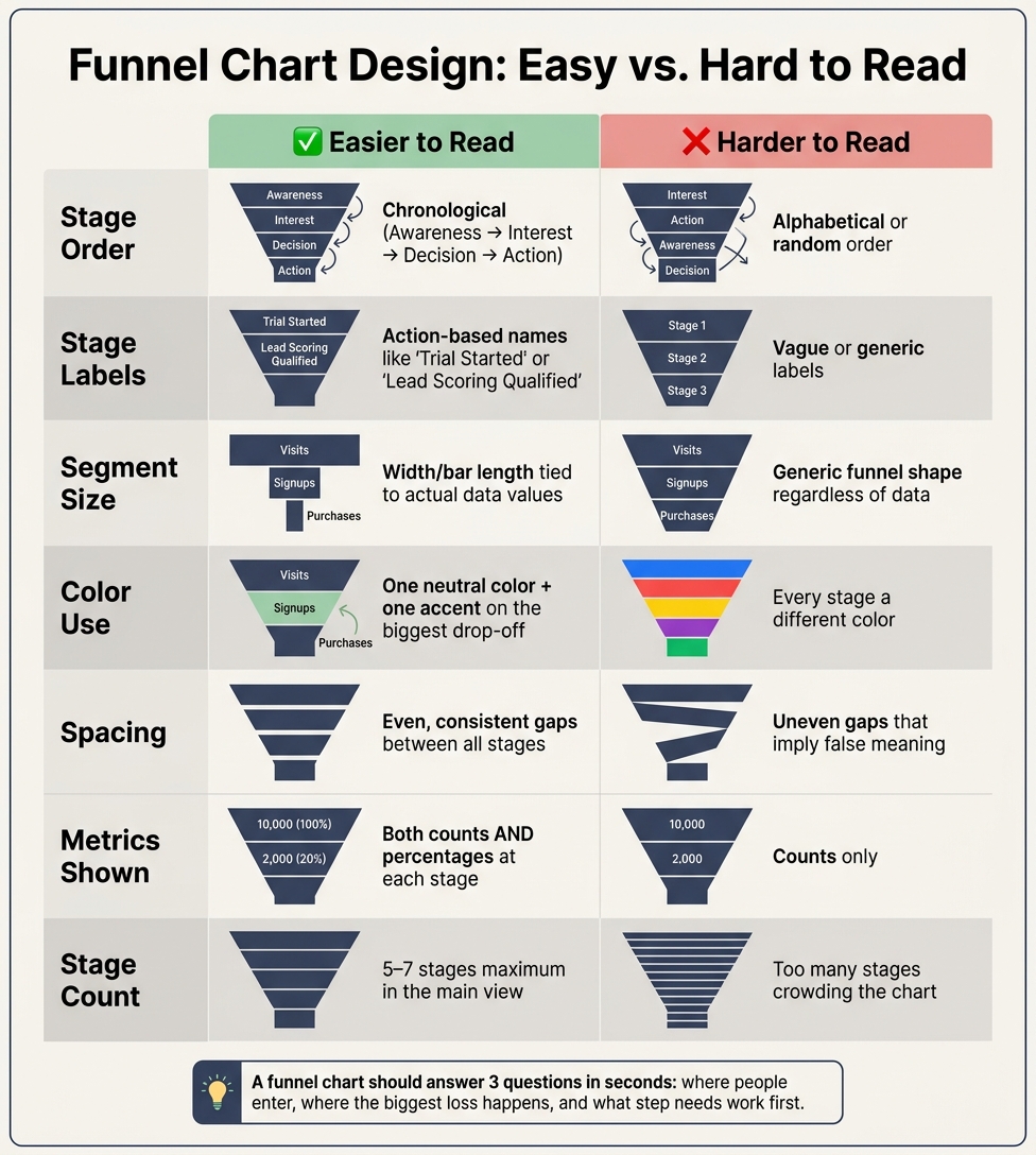
Funnel Chart Design: Easy vs. Hard to Read – 7 Best Practices
Small design choices can change how fast someone reads a funnel chart.
It helps to look at good and bad choices side by side. That way, the seven rules are easier to spot in action. You can see, in plain terms, what helps a reader move through the chart fast - and what slows them down.
Comparison table: easy-to-read vs. hard-to-read funnel choices
| Design Choice | Easier to Read | Harder to Read | Why It Affects Interpretation Speed |
|---|---|---|---|
| Stage Order | Chronological (Awareness → Interest → Decision → Action) | Alphabetical or random order | Readers follow the journey without having to mentally re-sort the stages. |
| Data Labels | Counts + percentages | Counts only | Percentages show stage efficiency at a glance. |
| Layout Style | Bar-style or column charts | Triangle or pyramid shapes | Bar lengths show volume more clearly; triangle area can distort volume differences. |
| Visual Focus | Highlighting drop-offs and next-stage rates | Showing only the final conversion rate | Showing the share that moves to the next stage helps readers find friction points faster. |
This kind of side-by-side view makes the core rules easier to notice in a real funnel.
Conclusion
A funnel chart should make drop-offs easy to see and show which stage needs attention.
The main rules to remember
Read a funnel in this order: stage order, labels, size, color, spacing, and drop-off metrics.
These seven rules work together. Use ordered stages, clear labels, proportional sizes, restrained color, even spacing, and both counts and percentages. Keep the funnel to only the stages needed to tell the story.
Before you share it, do a quick check. Can someone spot the entry point, the biggest drop-off, and the next action in a few seconds? If not, the chart needs another pass. And if the funnel still feels crowded or the process order is tough to follow, a bar chart may show the data more honestly.
Where to find funnel tools and learning resources
If you need tools to put these rules into practice, use a curated funnel resource directory. The Marketing Funnels Directory is a curated resource for finding funnel tools, vendors, courses, and books, organized by use case. It’s a practical starting point for teams looking for funnel tools and learning resources.
FAQs
When should I use a funnel chart instead of a bar chart?
Use a funnel chart to show a step-by-step customer journey and see where people drop off or get stuck. It fits best when you’re dealing with a process that moves through several stages and the path from one step to the next is the main point.
Use a bar chart when you need clear side-by-side category comparisons or when your audience cares more about exact values than process flow.
How do I choose which stage to highlight first?
Place funnel stages from top to bottom in the same order a customer moves through them - from awareness to loyalty.
Put the most important insight in the top-left area first. Make key metrics stand out with larger text, a bold color, and plenty of white space.
What should I do if my funnel has more than seven stages?
If your funnel has more than seven stages, you can start to lose people’s attention. Most experts suggest keeping it short - around four to six stages is a good range. Once you go past seven, the chart gets harder to read, and your team may have a tougher time analyzing what’s going on.
Need to track extra steps anyway? Use tooltips to show added details on hover. That way, the main chart stays clean and easy to scan without hiding the data you still want to keep.