Want to track where your marketing efforts succeed or fail? Funnel charts can help. They show how customers move through stages like Awareness, Interest, and Conversion, making it easier to spot drop-offs and opportunities. Here's what you need to know:
- Funnel charts highlight customer flow and drop-offs.
- Bar graphs compare performance across channels or stages.
- Waffle charts simplify percentage-based insights.
To create effective visuals, organize your data into clear stages and use tools like Google Analytics or HubSpot. Clean, standardized data ensures accuracy. Choose the right chart type based on your goal - funnel charts for flow, bar graphs for precise comparisons, or waffle charts for simple percentages. Add labels, metrics, and colors to make your charts easy to understand.
For more help, tools like the Marketing Funnels Directory provide resources to refine your strategies. The right charts can turn raw data into decisions that improve your marketing results.
Marketing Funnel Stages and Data Setup
Main Stages of a Marketing Funnel
Marketing funnels generally follow a logical flow, reflecting how customers move from discovering your brand to becoming loyal supporters. There are five key stages that form the foundation of most funnels: Awareness, Interest, Consideration, Conversion, and Loyalty/Retention.
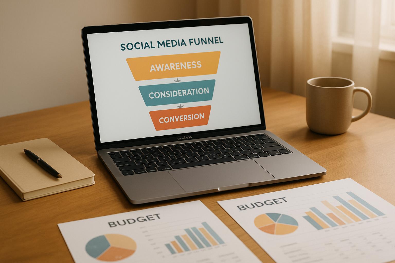
- Awareness: This is the broadest part of the funnel, where people first encounter your brand. It could be through social media posts, blog articles, or ads. The goal here is to reach as many potential customers as possible.
- Interest: At this stage, the audience starts engaging more meaningfully with your content. They might sign up for your newsletter, follow your social accounts, or spend time exploring your website. Their actions signal a genuine curiosity about your offerings.
- Consideration: Here, prospects actively evaluate your product or service. They may download guides, request demos, compare pricing, or read reviews. This stage is often where potential customers weigh their options before making a decision.
- Conversion: This is where prospects turn into customers. It’s the point where they complete a key action, like making a purchase or signing a contract. Since this stage often sees the steepest drop-off, it’s critical to monitor and optimize for better results.
- Loyalty/Retention: The focus shifts to keeping customers engaged and encouraging repeat business. Metrics like repeat purchases, referrals, and customer lifetime value are essential here, as they help measure long-term success.
Once these stages are clearly outlined, the next step is organizing your data for effective visual representation.
Setting Up Data for Funnel Charts
To create accurate funnel charts, you need to connect the right data sources and organize information into a format that’s easy to work with. Ideally, each funnel stage (Awareness, Interest, Consideration, Conversion, Loyalty/Retention) should be represented in a simple two-column table: one for the stage name and one for the corresponding user count.
Start by linking your primary data sources, such as CRM tools like HubSpot or analytics platforms like Google Analytics. These tools provide the essential metrics needed to track the customer journey across all funnel stages.
Make sure your tracking parameters are consistent to ensure reliable data. For example, using uniform UTM parameters allows you to follow a visitor’s path from their first interaction to conversion.
Next, standardize your data. Different platforms often use varying formats, so you’ll need to align them. For instance, use the MM/DD/YYYY format for dates and apply U.S. number conventions (e.g., 1,500 visitors or a 2.5% conversion rate).
Data cleaning is another crucial step. Remove duplicates, fix inconsistencies, and ensure uniformity in naming conventions. For instance, "Google Ads" and "Google Adwords" should be treated as the same source. Don’t forget to format currency consistently - use dollar signs for clarity (e.g., $1,250 for average order value).
The final dataset should clearly display how users progress through each funnel stage. For example, you might show the number of users at each stage, from awareness to retention, ensuring your charts accurately reflect your marketing performance.
How to create a Digital Marketing Funnel in Excel? | Funnel Chart | Pyramid Chart | Funnel Diagram
Picking the Right Chart Type for Marketing Funnels
Choosing the right chart type is crucial for effectively visualizing your marketing funnel. The way data is presented can either clarify or obscure insights. Three popular options for marketing funnels are funnel charts, bar graphs, and waffle charts - each offering distinct advantages and challenges.
Funnel Charts vs. Bar Graphs vs. Waffle Charts
Funnel charts are tailor-made for processes where users move step-by-step through a sequence. They excel at highlighting drop-offs and bottlenecks, making them ideal for funnel analysis. However, the traditional inverted triangle design can sometimes confuse readers, as both the width and area of the chart represent values. A "diminishing bars" variation solves this issue by offering a clearer, more proportional representation.
Bar graphs are a universal favorite thanks to their simplicity and versatility. They’re perfect for comparing values across categories and provide precise stage-to-stage comparisons. On the downside, bar graphs don’t naturally convey the concept of “flow,” which is central to funnel analysis. However, their precision makes them a reliable choice for detailed data representation.
Waffle charts use grids of squares, with each square representing 1% of the total, creating a visually engaging way to display percentages. They’re especially effective for non-technical audiences. That said, waffle charts are less precise when dealing with large datasets and are better suited for simplified insights rather than in-depth analysis.
Here’s a quick comparison of the three:
| Feature | Funnel Charts | Bar Graphs | Waffle Charts |
|---|---|---|---|
| Best For | Showing flow and drop-offs in processes | Precise comparisons across stages | Visualizing percentages in a simple format |
| Clarity | Clearer with diminishing bars; less so with triangles | Highly readable and familiar | Excellent for percentages; intuitive |
| Marketing Funnel Fit | Designed for funnel analysis | Suitable for comparing stage volumes | Great for percentage-based insights |
| Limitations | Needs 3+ stages; lacks detail for complex data | Requires a zero baseline; doesn’t show flow | Less precise with large datasets; best for simple visuals |
When to Use Each Chart Type
To make the most of these chart types, match your choice to the specific needs of your analysis.
- Funnel charts are your go-to for identifying bottlenecks and visualizing the flow of customer journeys. They’re especially effective in executive presentations where you need to highlight conversion rates across multiple stages. Use the diminishing bars variation for better clarity, and include both percentages and absolute numbers to make drop-offs easier to understand.
- Bar graphs are ideal when accuracy and detailed comparisons are the priority. They work well in analytical discussions where stakeholders need precise data on each stage. Bar graphs are also a strong choice when comparing multiple funnels side-by-side or when presenting to data-savvy audiences.
- Waffle charts shine when presenting to non-technical audiences or when percentages are more important than raw numbers. Their grid format makes drop-off rates immediately clear and engaging. They’re particularly effective in marketing reports for general stakeholders. Use consistent icons and distinct colors to avoid confusion.
For processes with only two stages, funnel charts aren’t suitable; instead, consider pie charts or donut charts. On the other hand, if you’re dealing with more than 30 categories, bar graphs may become cluttered, making waffle charts or simplified funnel charts better options.
How to Create Funnel Charts Step by Step
Creating funnel charts that effectively communicate your data involves three main steps: organizing your data, building the chart, and customizing it to enhance its clarity and impact.
Setting Up Stage Data for Charts
The foundation of a funnel chart is well-organized data. You’ll need two key elements: a list of sequential stages and their corresponding numerical values. These numbers should represent actual counts - such as users, leads, or items - progressing through each stage of your process.
To keep things simple, structure your data in a two-column table. One column should list the stage names, while the other contains the numbers. Here’s an example of how an email marketing funnel might look:
| Stage | Users |
|---|---|
| Email Sent | 5,676 |
| Email Opened | 3,872 |
| Clicked Link | 1,668 |
| Added to Cart | 610 |
| Completed Purchase | 565 |
When defining stages, aim for 3 to 7 distinct steps. Too many stages can clutter the chart, while too few may obscure important insights. Stick to absolute counts rather than percentages, as most tools can calculate conversion rates and drop-off percentages for you. This keeps your input data straightforward while allowing the visualization tool to handle the more complex metrics.
Also, consider the level of detail needed to convey your message effectively. Tailor the number of stages to match the depth of analysis required.
Creating a Funnel Chart
Once your data is ready, it’s time to build the chart. Most popular tools, like Google Charts, Tableau, Power BI, or Excel, make this process straightforward.
Start by selecting the funnel chart option in your chosen tool’s library. Then, import your two-column data. Most platforms allow you to copy and paste from a spreadsheet or upload a CSV file, ensuring your stage labels and values are correctly recognized.
Next, configure the basic settings to ensure your stages are displayed in the right order - from the largest number at the top (the start of the funnel) to the smallest at the bottom. If the sequence is incorrect, many tools offer drag-and-drop or sorting options to fix it.
Add labels and annotations to make your chart easy to understand. Include stage names, absolute numbers, and conversion percentages where applicable. Many visualization tools automatically calculate and display these metrics, showing how users progress - or drop off - between stages.
Customizing Charts for Better Results
Customization can make your funnel chart more engaging and insightful. Use a consistent color scheme to emphasize the flow of data - darker shades for higher numbers and lighter ones for smaller volumes.
If certain stages show a sharp drop-off, use contrasting colors or callouts to highlight these problem areas. This makes it easier for viewers to pinpoint where improvements might be needed.
Include key metrics directly on the chart. Display conversion rates or other critical numbers prominently so stakeholders can quickly grasp the most relevant data without additional calculations.
For added context, consider including details like timeframes, campaign names, or benchmarks. This helps viewers interpret the chart within the right framework.
Finally, ensure your chart is easy to read. Use concise labels (e.g., "Email Opened" instead of longer descriptions) and format numbers using U.S. conventions (e.g., 5,676 instead of 5676). Test the chart with colleagues or stakeholders to confirm its clarity. Their feedback can help you refine the presentation and ensure the chart communicates your message effectively.
sbb-itb-a84ebc4
Best Practices for Funnel Data Charts
Creating effective funnel charts isn't just about plotting data points. It's about presenting information in a way that transforms complex data into actionable insights. A well-designed funnel chart can guide decisions and drive results.
Making Charts Clear and Consistent
Consistency and clarity are the backbone of any professional funnel chart. Start with a strategic use of color: darker tones should highlight critical stages, while lighter shades can represent secondary elements. This approach naturally draws attention to the most important parts of the chart.
Stick to a clean, sans-serif font for all labels and numbers. Keep font sizes uniform - use one size for labels and another for numerical data to maintain visual harmony. Avoid abbreviations like "Conv Rate" and instead spell out terms like "Conversion Rate." Tailor your language to the audience; for instance, replace technical terms like "Qualified Leads" with more relatable phrases like "Potential Customers" when addressing executives.
White space is your friend. Avoid overcrowding the chart by clearly separating funnel segments and ensuring there’s no overlap between text and visuals. This not only improves readability but also makes your chart more visually appealing.
Always consider how your audience will view the chart. For virtual presentations, use larger fonts and high-contrast colors to ensure visibility. For printed materials, check how the chart looks in grayscale to confirm it remains legible even without color.
Showing Key Metrics and Problem Areas
To make your funnel chart truly insightful, highlight key metrics and performance gaps directly on the chart. Annotate conversion rates and drop-offs prominently near the narrowing points of the funnel. This eliminates the need for viewers to calculate percentages on their own, speeding up comprehension and decision-making.
When performance dips between stages, use visual cues like contrasting colors or icons to signal potential problem areas. These elements can guide the audience to focus on segments that may need further analysis.
For added context, include a benchmark table next to the chart. This table can compare current performance with past data or industry standards, helping viewers quickly assess whether conversion rates are on track or need improvement.
If your audience includes analytical thinkers, consider placing detailed data tables alongside the chart. These tables can display specific numbers, conversion ratios, and period-over-period changes, catering to those who prefer a deeper dive into the data.
Use callout boxes to explain any unusual patterns in the data. For instance, if there's a sudden spike or drop at a specific stage, a brief note suggesting potential causes can help the audience understand what might be driving the change.
You can also enrich your chart with time-based annotations. Mark important dates like product launches, promotional campaigns, or external events that could have influenced performance. These annotations add valuable context, helping to explain seasonal trends or the impact of specific initiatives.
The goal is to design a chart that answers key questions at a glance. By emphasizing critical stages, clearly displaying metrics, and adding contextual details, your funnel chart can become a powerful tool for driving insights and action.
Using the Marketing Funnels Directory for Better Results
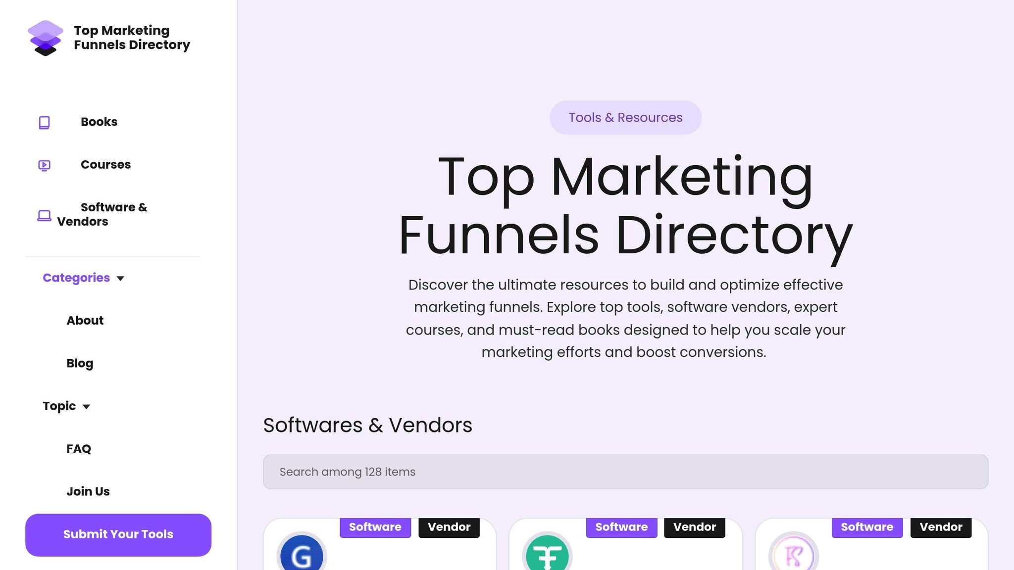
As mentioned earlier, having clear and effective funnel visualizations is essential. But creating great funnel charts isn't just about knowing how to visualize data - it also requires the right tools and guidance. That’s where the Marketing Funnels Directory comes in. This centralized resource takes the concepts of funnel visualization a step further by giving you easy access to tools and strategies designed to simplify and improve your funnel-building process.
Why Use the Marketing Funnels Directory?
The Marketing Funnels Directory acts as a one-stop hub for everything you need to build and refine your marketing funnels. Instead of wasting time jumping between multiple sources, you’ll find everything in one place, from software recommendations to educational content.
The directory organizes its resources into focused categories like social media funnels, advertising campaigns, content marketing strategies, and B2B lead generation. This setup makes it easy to locate tools and advice tailored to your unique needs. For example, if you're working on a B2B funnel, you'll find resources designed for longer sales cycles and teams with multiple decision-makers. On the other hand, social media funnel resources are geared toward fast-paced engagement and tracking conversions.
For businesses in the U.S., the directory includes localized tools and pricing options, ensuring compatibility with your operations while saving you time. Additionally, it offers access to courses and books that go beyond just creating charts - they help you interpret the data to guide smarter marketing decisions. Whether you’re using funnel charts, bar graphs, or waffle charts, the directory ensures you have the right tools for every scenario.
Tools and Analytics for Funnel Visualization
In addition to strategic advice, the Marketing Funnels Directory connects you directly to the technical tools that make funnel visualization easier and more effective. Instead of relying on generic spreadsheet software, you’ll find platforms with built-in funnel templates, automated data integration, and options for customization.
Many of these tools support real-time data integration, meaning your charts can update automatically without the need for constant manual adjustments. This keeps your information accurate and up-to-date.
The directory also provides vendor listings that let you compare analytics platforms based on factors like pricing, integration options, and reporting features. Some tools even specialize in specific chart types - whether it’s traditional funnel charts, bar graphs, or waffle charts - and allow you to switch between visualizations depending on your audience or presentation style.
For those looking to go beyond basic visuals, the directory includes resources for advanced funnel analytics. These tools help pinpoint bottlenecks in your funnel and offer actionable insights to improve performance.
The directory is designed to help you find the best fit for your business, whether you’re a small operation needing occasional funnel presentations or a larger company requiring a comprehensive analytics platform for continuous optimization. By filtering options based on your budget, business size, and technical needs, you can make informed choices without feeling overwhelmed.
Conclusion: Improving Marketing with Better Funnel Charts
This guide has emphasized the importance of clear visualization in turning marketing data into actionable insights. When done right, funnel visualizations can transform raw numbers into strategies that fuel business growth. The key is selecting the right type of chart, ensuring your data is accurate, and utilizing helpful tools to streamline your process.
Choosing the right chart type is crucial. Funnel charts are perfect for presenting the entire customer journey in executive meetings, bar graphs are ideal for comparing data over time, and waffle charts make conversion rates easy to grasp in team discussions.
Of course, none of this works without accurate data. Clean, consistently formatted, and regularly validated data ensures that your visualizations reflect your marketing performance truthfully.
For additional support, the Marketing Funnels Directory offers a curated collection of tools and vendor options tailored to fit your budget, business size, and technical needs. This resource can be a game changer in refining your funnel strategies.
The ultimate goal of your funnel charts should be to drive decisions, not just inform them. By pinpointing bottlenecks and tracking progress, your visualizations become tools for smarter budget allocation, campaign tweaks, and long-term planning. When your team can clearly see where prospects drop off and which stages are thriving, everyone can focus on the areas with the most potential for growth.
FAQs
What’s the best chart type for visualizing my marketing funnel?
Choosing the right chart type is all about what you want to showcase in your marketing funnel. If you're looking to highlight the flow of prospects and where drop-offs occur, funnel charts are your go-to. They make it simple to see how leads progress through each stage. For comparing different categories or funnel stages, bar charts or column charts are ideal, especially when your data follows a natural order. When it comes to showing changes or tracking progress over time, line charts or trend charts are the best fit.
The key is to align the chart type with your specific objective - whether it’s visualizing flow, making comparisons, or analyzing trends - to create a clear and impactful representation of your data.
What mistakes should I avoid when preparing data for funnel charts?
When creating data for funnel charts, it's crucial to keep things straightforward and honest. Adding extra labels or regions that don't add value can skew the chart's meaning and confuse your audience. Make sure your data is accurate and consistent at every stage to avoid presenting misleading conclusions.
It's also important to steer clear of misusing categorical axes or including metrics that don't directly relate to the funnel's purpose. These missteps can make your chart harder to understand and distract from its main message. Stick to a clear and simple design to ensure your funnel chart is both easy to interpret and effective in delivering insights.
How does the Marketing Funnels Directory simplify funnel visualization and analysis?
The Marketing Funnels Directory simplifies the process of visualizing and analyzing customer journeys by offering tools that make mapping and tracking these paths straightforward - even if you don’t have a technical background. These tools are designed to help you uncover clear, actionable insights, enabling you to fine-tune your marketing strategies with ease.
On top of that, the directory includes resources curated by experts to help you grasp essential metrics and sharpen your funnel strategies. This makes it easier to enhance performance and guide your customers more effectively through their journey.