Data visualization transforms how B2B teams manage sales funnels by making complex data easier to understand and act on. Companies using visual tools report a 28% revenue increase, thanks to faster decision-making, better collaboration, and clearer insights into funnel performance. Here's what you need to know:
-
Key Benefits:
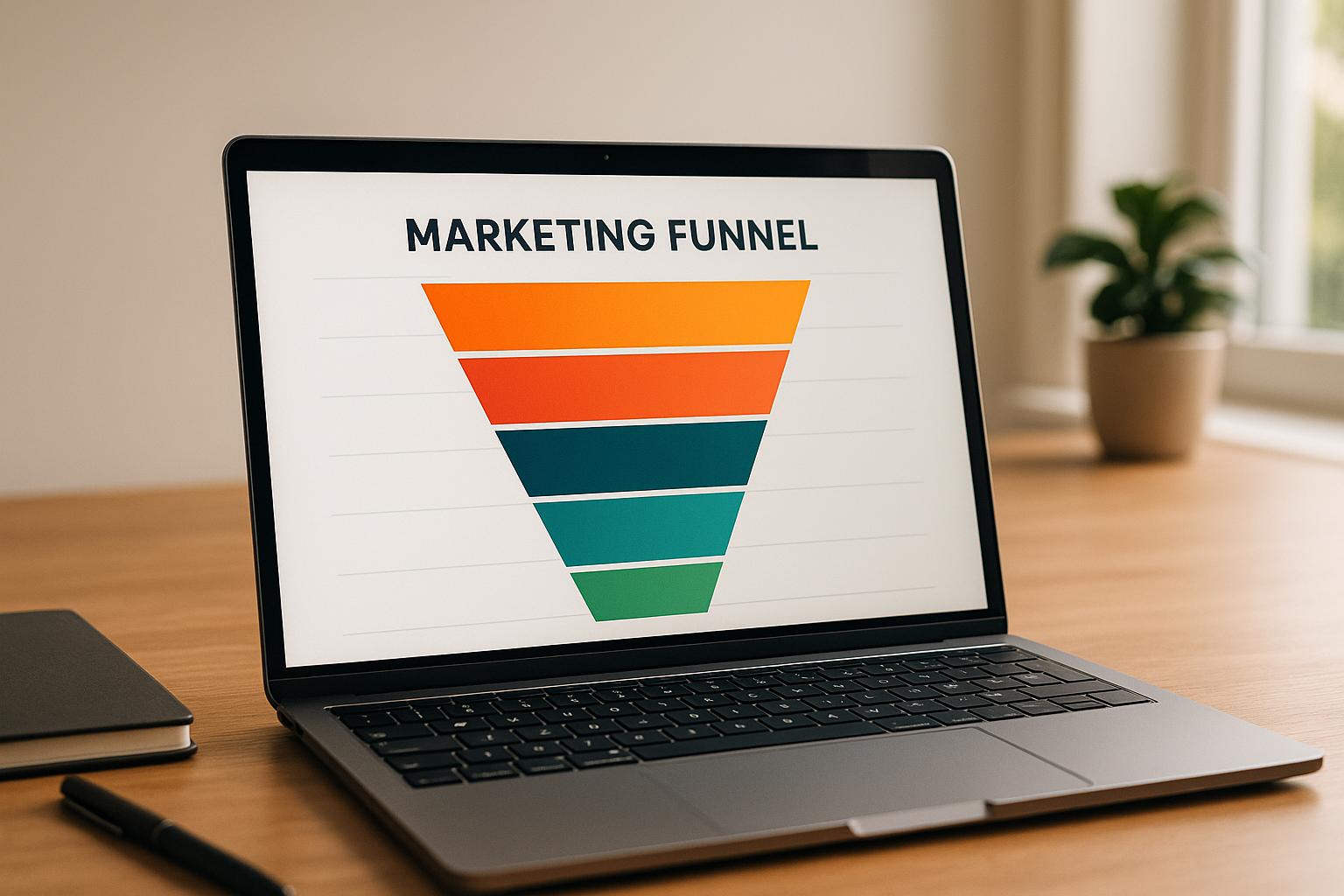
- Spot bottlenecks and drop-offs with funnel charts.
- Track trends over time with line graphs and heat maps.
- Use real-time dashboards to monitor conversion rates and pipeline health.
- Align sales and marketing teams with shared visual insights.
-
Why It Matters:
- Average B2B funnel conversion rates are 2%–5%. Even small improvements in website conversions (e.g., 0.5%) can significantly boost pipeline growth.
- Visual tools reveal patterns spreadsheets often miss, like seasonal trends or underperforming channels.
-
Actionable Steps:
- Start with simple dashboards tracking key metrics like lead conversion rates.
- Use tools like pie charts, scatter plots, and heat maps to analyze performance.
- Regularly review visual data as a team to improve collaboration and strategy.
Data visualization isn’t just about making data look good - it’s about driving better results through clarity and insight.
The Best Funnel Analytics Dashboard for Salesforce!
Turning Raw Data Into Usable Information
B2B teams gather funnel data from various sources: website visits, form submissions, emails, and demo requests. The real challenge, however, lies in interpreting this data quickly enough to improve performance.
That’s where data visualization steps in. By converting rows of numbers into easy-to-read charts, graphs, and dashboards, it reveals what’s happening in your funnel at a glance. Patterns and trends become instantly clear, enabling teams to identify issues faster and make confident decisions. This shift from raw numbers to visuals accelerates how quickly teams can spot problems and act on them.
How Visuals Simplify Complex Data
Visuals are processed far more quickly than raw data. A well-crafted chart can make trends and outliers jump out immediately, cutting response times when funnel issues arise.
But effective visualizations do more than just simplify; they uncover connections that spreadsheets often hide. For instance, a line graph might expose how seemingly unrelated metrics interact, revealing patterns that can shape strategic decisions. Beyond this, visuals provide context - offering a broader understanding of market trends and customer behavior that raw numbers alone can’t deliver.
These tools also drive tangible business results. Research shows that data-driven teams can boost ROI by up to 30% by identifying funnel bottlenecks and optimizing processes in real-time.
Next, we’ll explore the types of visualizations that effectively decode raw data.
Common Visualization Types for Funnel Analysis
Different types of visualizations cater to specific analytical needs, and selecting the right one is crucial for funnel analysis:
- Funnel charts: Break down each stage of the sales process, making it easier to spot drop-off points.
- Heat maps: Use color coding to highlight trends, such as regional performance differences, aiding resource allocation.
- Scatter plots: Show relationships between metrics, like how pricing impacts sales volume.
- Line graphs: Track changes over time, helping teams identify seasonal trends or sales spikes.
Analytics platforms that incorporate these visual tools offer actionable insights into funnel performance. They help teams pinpoint where prospects drop off and refine strategies to improve conversion rates.
The key is aligning the visualization type with the specific question you’re trying to answer. Whether you’re analyzing overall funnel flow, comparing regional performance, or examining variable correlations, tailored visualizations turn raw data into actionable strategies that enhance every stage of the B2B funnel.
Monitoring Funnel Metrics with KPI Dashboards
Transforming raw data into compelling visuals is just the beginning. Real-time dashboards take it a step further, allowing teams to monitor funnel performance continuously. By consolidating key funnel metrics into a single view, these dashboards eliminate the need for weekly reports or manual data collection from various sources. Teams can instantly see what’s happening at every stage of the funnel - from the first website visit to a closed deal. This streamlined approach not only makes KPI tracking more efficient but also fosters better team alignment.
Monitoring Funnel Performance with Real-Time Dashboards
Real-time dashboards provide instant access to critical funnel metrics, sidestepping the delays and limitations of traditional spreadsheet tracking. Instead of static data, teams get a dynamic, up-to-date view of performance. These dashboards simplify complex data into easy-to-understand visuals. For example, a sales dashboard might display total sales by region, immediately highlighting which areas need attention. Pie charts can break down lead sources, showing whether organic search, paid ads, or referrals are driving the most conversions. Meanwhile, line graphs can track performance trends over time, uncovering seasonal patterns or sudden shifts in conversion rates. Customizable blocks allow teams to organize metrics by factors like engagement, demographics, or key accounts - helping marketing focus on lead generation while sales zeroes in on pipeline progression.
One of the most valuable features is the ability to monitor conversion rates at each funnel stage. For B2B SaaS companies with annual recurring revenue between $10 million and $100 million, common benchmarks include: 1.4% of visitors convert to leads, 41% of leads become marketing qualified leads (MQLs), 39% of MQLs turn into sales qualified leads (SQLs), 42% of SQLs advance to opportunities, and 39% of opportunities close. When these metrics are displayed in real time, teams can quickly identify dips in performance and investigate the causes. Heat maps add even more depth, using color coding to highlight regional differences or product popularity across segments - making it easier to act on significant trends or shifts.
Advantages of Visual KPI Tracking in B2B Funnels
Data visualization doesn’t just make metrics easier to track - it also drives results. Companies leveraging data visualization in B2B sales have reported a 28% revenue increase by improving metric tracking and fostering better collaboration between teams. With dashboards, decisions can be made faster, as teams can immediately pinpoint underperforming areas without waiting for manual data updates.
Visual KPI tracking also helps businesses allocate resources more effectively. For example, if a dashboard shows that SEO-driven leads convert at 2.1% from visitor to lead and 51% from MQL to SQL, while PPC leads lag behind at 0.7% and 26%, businesses gain clear insights to guide budget allocation. When marketing and sales teams share the same clear, visual representation of the funnel - tracking where quality leads originate and how prospects move through the pipeline - they can align their strategies more effectively to tackle conversion challenges. Side-by-side pie charts, for instance, can reveal year-over-year trends in lead capture, helping teams determine whether efforts are improving or need adjustment.
Most importantly, real-time dashboards empower teams to respond quickly to changes in customer behavior and seize new opportunities. Even a small improvement, like a half-percentage point increase in website conversion rates, can ripple through the entire pipeline, lowering customer acquisition costs and boosting revenue. By simplifying the process of spotting incremental improvements, visual KPI tracking helps businesses achieve long-term growth through consistent, data-driven optimization.
Identifying Patterns and Trends Through Visualization
Once you’ve set up real-time dashboards, the next step is to use visual patterns to identify which parts of your funnel are thriving and which need attention. Spreadsheets often obscure trends like seasonal slumps, underperforming channels, or costly bottlenecks. However, visualization tools can transform raw data into clear patterns, helping you predict outcomes and tweak your marketing strategies before small issues grow into major problems.
Analyzing patterns this way can lead to better ROI and smoother transitions between funnel stages by identifying bottlenecks and making real-time adjustments. The trick lies in choosing the right visualization tools to uncover specific insights - and then acting on those discoveries. This approach empowers you to make quick, strategic decisions based on what the data reveals.
Tools for Analyzing Trends and Patterns
To make the most of your data, different visualization tools offer unique advantages:
- Line Graphs: These are perfect for tracking changes over time, such as monthly or yearly sales performance. Seasonal trends, like dips in conversion rates, often stand out immediately. Spotting these patterns allows you to plan ahead, adjusting your marketing calendar to align with anticipated demand.
- Heat Maps: When analyzing regional or segment-specific data, heat maps make it easy to see which products or campaigns perform best in different areas. For example, if you’re running campaigns across multiple states, a heat map might reveal that one region’s leads convert at a much higher rate than another’s. This insight can guide budget reallocations or prompt you to investigate why certain areas outperform others.
- Scatter Plots: These are invaluable for uncovering relationships between variables. For instance, a scatter plot might highlight a connection between pricing and sales volume, giving you the data you need to refine your discounting strategy or adjust nurturing campaigns.
- Side-by-Side Pie Charts: Comparing two pie charts - such as one showing last year’s lead sources and another showing this year’s - can quickly reveal shifts in performance. If you’ve shifted focus from paid ads to organic content, this tool can show whether the change is delivering results.
These tools excel where spreadsheets fall short, uncovering connections and trends that might otherwise go unnoticed. For example, a line graph linking marketing spend to sales revenue can clarify how much investment is needed to drive growth, enabling smarter budgeting decisions. Companies using these visualization techniques in B2B sales have reported a 28% revenue boost by selecting tools that enhance metric tracking.
Adjusting Strategy Based on Data Patterns
Real-time monitoring combined with pattern recognition enables proactive strategy adjustments. By identifying recurring trends, you can anticipate demand, reallocate resources, and adjust lead nurturing efforts right away. For instance, if certain products consistently perform better during specific seasons, you can focus your marketing efforts on those products before the peak season begins, rather than reacting after it’s already underway.
Interactive dashboards make this process even more effective by providing up-to-date data that reflects the latest customer interactions. If you notice a sudden spike in demand, you can immediately increase inventory or launch targeted campaigns to capitalize on the opportunity. In competitive B2B markets, this kind of responsiveness can make a significant difference in conversion rates.
Dashboards can also reveal which content generates the most qualified leads and which calls-to-action might need improvement. For example, if one type of content consistently delivers higher conversion rates, you’ll know to prioritize producing similar materials. Even small adjustments based on these insights can lead to big results. Since most B2B sales funnels convert only 1% to 5% of leads, even a slight improvement in your visitor-to-lead conversion rate can dramatically increase your pipeline and reduce customer acquisition costs.
The key is to ask the right questions when analyzing your visualized data: Are there specific points in the funnel where traffic drops off significantly? Which content types deliver the best leads? Are certain calls-to-action underperforming? By systematically examining these patterns and making data-driven adjustments, you create a feedback loop that continuously improves your funnel’s performance over time.
sbb-itb-a84ebc4
Improving Team Collaboration with Data Visualization
Relying on scattered spreadsheets often leads to conflicting data interpretations across teams. For instance, one group might believe lead quality is improving, while another sees a decline - simply because they're analyzing different metrics or timeframes. Visual dashboards solve this issue by offering a single source of truth that anyone can access and understand, no matter their technical expertise. This shared perspective enables unified team actions, streamlining workflows and boosting overall funnel performance.
The benefits of this alignment are quantifiable. Companies that integrate data visualization into their B2B sales processes report a 28% increase in revenue by using the right visuals to track metrics and share insights across teams. This improvement comes from eliminating miscommunication and ensuring everyone works toward the same goals.
Aligning Teams Through Shared Dashboards
Shared dashboards act as a universal language, presenting data in formats that are easy for everyone to understand. Instead of marketing interpreting raw data one way and sales another, both teams see the same visual insights and reach consistent conclusions.
This approach breaks down departmental silos. For example, a pie chart showing which channels generate the most leads helps marketing focus their efforts while giving sales a clearer view of where their qualified leads originate. By aligning on a single, clear data view, both teams can make better decisions about resource allocation.
Some of the most effective visualizations for team alignment include:
- KPI dashboards for tracking performance metrics.
- Funnel charts to visualize progression through sales stages.
- Line graphs for identifying trends over time.
Other tools, like heat maps and scatter plots, make complex relationships easy to spot, even for those without advanced analytics skills.
For instance, side-by-side pie charts comparing year-over-year lead capture trends can spark strategic discussions about productivity. Teams can immediately see how lead sources have shifted and assess whether those changes are delivering results.
Real-time dashboards take this a step further by providing instant access to current data. If analytics reveal a spike in demand for a particular product, marketing can launch targeted campaigns while sales ramps up outreach - all based on the same dashboard insights. This agility eliminates the delays of waiting for weekly or monthly reports.
To maximize effectiveness, dashboards should be tailored to each team's needs. For example, marketing might focus on engagement metrics, sales on lead qualification data, and management on overall pipeline health. Customizable sections ensure that everyone gets the information they need without being overwhelmed by irrelevant details.
Better Collaboration in Lead Qualification
The transition between marketing and sales is a common pain point in B2B funnels. Marketing might send leads they consider qualified, only for sales to reject them as unready. This disconnect wastes time and strains relationships. Visual dashboards can help by establishing clear, measurable lead qualification standards that both teams can agree on.
When marketing and sales share access to data on lead engagement, demographics, industry, and company size, they can work together to define what makes a lead "qualified" before handing it off. Visual tools make it easier to align on what constitutes a Marketing Qualified Lead (MQL) versus a Sales Qualified Lead (SQL). This shared understanding ensures sales focuses on leads most likely to convert, while marketing gains insight into the types of leads sales values most.
In companies with well-aligned teams, MQL conversion rates can climb to 40% or even 50% by refining definitions and scoring rules.
Dashboards can also break down lead funnel data into modular sections, such as engagement metrics, demographics, and top accounts. This setup allows marketing to concentrate on lead generation while sales zeroes in on qualification - yet both teams maintain access to the full picture when needed.
Lead scoring systems supported by visual dashboards help prioritize high-potential prospects, reducing friction in the marketing-to-sales handoff. For example, if a dashboard shows that email and referral channels convert at 2.4% and 2.9%, respectively, compared to paid social at 0.9%, both teams can focus their efforts on the most effective channels.
Multi-touch attribution visualizations further enhance collaboration by showing sales which marketing channels and campaigns produce the best leads. This transparency fosters trust and encourages productive discussions about budget allocation. Instead of questioning why marketing invests in certain channels, sales can see the data-backed results of those investments.
Regular cross-functional reviews using dashboards help teams identify where prospects drop off in the funnel and develop solutions together. Bottlenecks often occur during the consideration and evaluation stages, where decision-making slows lead progression. Visualizing these issues helps teams address them - whether by creating better content for the consideration stage or simplifying the evaluation process.
Finally, shared dashboards ensure consistent messaging and strategy alignment. When marketing, sales, and management all view the same funnel performance data, they gain a unified understanding of what’s working and what isn’t. For example, if a dashboard highlights which content generates the most qualified leads, all teams can focus their efforts on promoting that content. This eliminates conflicting strategies and keeps everyone on the same page.
Improving Lead Generation and Pipeline Management
After diving into dashboard collaboration, let's shift focus to how visual insights can transform lead generation and pipeline management. Visual tools simplify complex data, helping B2B teams take immediate, informed action. Instead of relying on manual checks, teams can quickly identify trends and respond accordingly. This clarity can boost ROI by up to 30% and improve funnel conversions by addressing bottlenecks and enabling real-time adjustments. Even small improvements in each stage of the funnel can add up to a significant increase in overall results.
Tracking Lead Sources and Engagement with Visuals
Visual tools go beyond just tracking KPIs - they reveal which marketing channels bring in the most qualified leads, making resource allocation more effective. Tools like pie charts and comparative dashboards highlight how different channels perform over time. For example, in B2B SaaS companies, SEO typically converts visitors to leads at a rate of 2.1%, compared to PPC’s 0.7%. SEO-sourced leads also have a stronger MQL-to-SQL conversion rate of 51%, while PPC trails at 26%.
Other visualizations, like heat maps, can show which products or services attract the most interest from specific regions or customer segments. Scatter plots can help connect marketing spend with lead quality, and line graphs can reveal seasonal engagement trends. These insights allow sales teams to adjust their strategies on the fly, ensuring high-engagement leads get the attention they need.
Advanced analytics platforms now offer multi-touch attribution, mapping out the full customer journey. Instead of only crediting the final touchpoint, these tools show how every interaction - from an organic search to a webinar - contributes to lead conversion. This level of detail helps teams understand the effectiveness of their efforts and refine campaigns for better results.
Real-time data visualizations also uncover opportunities that static reports might miss. For instance, if a dashboard detects a spike in demand for a particular product, teams can immediately launch targeted campaigns or adjust nurturing strategies. This kind of agility is especially critical in B2B sales, where identifying high-intent leads early can have a big impact on closing deals.
Using Visuals to Track Pipeline Progress
Pipeline visualizations offer a clear picture of overall health. For example, if 60% of leads enter the pipeline but only 15% make it to the sales-qualified stage, it’s a clear sign of a bottleneck in lead qualification. This insight can prompt teams to revisit lead scoring methods, nurturing strategies, or sales readiness processes.
Bottlenecks often occur during the consideration and evaluation stages in B2B sales, where decision-making can slow progress. Dashboards that display conversion rates for each stage help teams quickly identify weak points. Industry benchmarks show SQL-to-opportunity conversion rates typically range from 36% to 49%, while opportunity-to-close rates fall between 31% and 39%. If performance dips below these benchmarks, visual tools make it easy to pinpoint the problem areas and guide optimization efforts.
Different teams require different data views. Executives might focus on high-level metrics like total pipeline value and revenue impact, while sales teams need detailed insights into individual lead status and engagement. Marketing teams, on the other hand, benefit from dashboards that highlight lead source performance and campaign success rates. Tailored dashboards ensure everyone has the information they need to make informed decisions.
By replacing spreadsheets with intuitive visual dashboards, teams can quickly identify engaged leads, spot pipeline stages that need attention, and prioritize opportunities nearing closure. For example, a dashboard showing lead engagement scores, deal size, and days in the pipeline helps sales managers focus on high-potential opportunities and allocate resources effectively. Lead scoring systems integrated with these dashboards further minimize guesswork by showing how scoring criteria align with actual conversions, enabling teams to focus on strategies with the highest ROI.
The results speak for themselves. While B2B funnels often convert only 1% to 5% of leads due to longer sales cycles, achieving a 3% to 5% lead-to-customer conversion rate is considered strong in many industries. Opportunity-to-close rates typically average between 20% and 30%. Visual tools help teams identify underperforming stages and address issues before they affect revenue.
Finally, customized visual reporting ensures that marketing, sales, and management teams are aligned. By working from the same data-driven insights, teams can streamline communication and stay focused on refining lead generation and pipeline strategies. This shared visual framework keeps everyone on the same page and drives more effective collaboration.
A/B Testing and Ongoing Funnel Improvement
Refining your funnel strategy often hinges on A/B testing, and using visual tools takes this process to the next level. These tools allow teams to see the results of tests in real time through dashboards and charts, enabling quicker, more confident decisions about what changes actually enhance performance. This visual approach fosters a cycle of steady, incremental improvements.
How Visualizations Elevate A/B Testing
Visual comparisons make it easy to identify winning variations. For example, testing different call-to-action buttons, landing page layouts, or email messaging becomes more straightforward when bar charts present conversion rates side by side. This eliminates the need to sift through spreadsheets or manually crunch numbers.
Line graphs are another powerful tool, especially for tracking how conversion rates shift throughout a test. If one variation shows consistent growth while another fluctuates, these patterns clearly indicate which option is more effective.
Heat maps, on the other hand, highlight areas of user engagement. During A/B tests, these maps can reveal behaviors that raw numbers often fail to show.
Real-time dashboards are a game-changer for teams. With continuously updated metrics and visual cues - like green for meeting targets and red for underperformance - teams can act immediately on test results without waiting for manual analysis.
Visualizations also uncover insights beyond initial hypotheses. For instance, analyzing test results by customer segment, industry, or geographic region might reveal that a winning variation performs differently across audiences. A scatter plot comparing pricing strategies against sales volume could show that a specific price point works well for mid-market companies but falls short for enterprise clients. These discoveries often lead to secondary tests and inform future strategies.
Interactive dashboards further enhance collaboration. During presentations, teams can drill down into specific data points to answer leadership’s questions about test outcomes. This real-time exploration builds trust in the findings and secures buy-in for implementing successful changes.
These visual insights naturally integrate into a culture of continuous improvement, turning A/B testing into an ongoing practice rather than a one-time effort.
Building a Culture of Continuous Improvement
Visual tools make it easier to track performance metrics over time, enabling teams to measure the long-term impact of their efforts. For instance, a line graph showing 12 months of conversion rates - annotated with each A/B test - illustrates how incremental changes add up over time.
Even small improvements can have a big impact. If an initial test boosts conversions by 0.5% to 1.0% and subsequent tests build on that success, the cumulative effect across the funnel can significantly reduce customer acquisition costs. Visualizing these gains makes the value of continuous testing clear.
Key metrics to track visually include conversion rates by funnel stage, cost per lead, lead-to-customer velocity, and engagement metrics for various content types. By comparing these data sets, teams can pinpoint which optimizations deliver the best ROI and prioritize future tests accordingly. For example, a stacked bar chart can show how different changes contribute to overall performance, highlighting the most impactful tests.
Managing multiple tests simultaneously requires a disciplined approach to visualization. Each test should have a dedicated dashboard displaying the specific metrics, variants, and real-time data being tracked. Consistent color coding across dashboards helps teams quickly identify winning variations. A master dashboard with a high-level view of all active tests ensures nothing falls through the cracks and prevents premature implementation of results.
The process starts with establishing baseline metrics and visualizing them in a central dashboard. Teams then conduct sequential A/B tests, using visualizations to assess whether each change drives improvement. This approach transforms A/B testing into a continuous cycle where each test builds on the last.
A "funnel health scorecard" that tracks metrics across all stages can reveal whether improvements in one area are causing bottlenecks elsewhere. This broader view ensures that optimizations strengthen the entire funnel, not just individual segments.
With B2B funnel conversion rates typically ranging between 2% and 5%, visual tools help identify weak spots and address them before they impact revenue. By clearly demonstrating the cumulative value of these efforts, teams can justify ongoing investments in testing and optimization to leadership.
Conclusion
Data visualization has transformed the way B2B teams approach their sales funnels. Instead of combing through endless spreadsheets, teams can now clearly see where prospects drop off, identify successful strategies, and allocate resources more effectively. This shift is about more than just creating attractive charts - it’s about achieving measurable business outcomes.
Key Takeaways from the Research
The research underscores how impactful visualization can be. B2B companies leveraging data visualization tools report notable revenue growth by using visuals to track metrics and improve team collaboration. It’s not just about aesthetics; it’s about making quicker, smarter decisions that drive results.
Visual tools simplify complex sales data, turning it into insights teams can act on immediately. For instance, if a funnel chart reveals that 60% of leads drop off during the qualification stage but only 10% at the proposal stage, teams know exactly where to focus their efforts.
The efficiency gains are undeniable. Dashboards help teams quickly identify underperforming areas and adjust strategies to improve outcomes. Tools like heat maps pinpoint which products perform best in certain regions, scatter plots show how pricing impacts sales, and line graphs highlight seasonal trends that might otherwise go unnoticed. These insights help teams target areas with the highest potential for return on investment.
Collaboration also sees a boost when visual dashboards are shared across departments. Marketing and sales teams can align on which lead sources are working best, reducing misunderstandings and fostering shared goals. Features that break down data by factors like engagement, demographics, or industry make it easier for teams to access relevant insights and work together effectively.
With B2B funnel conversion rates typically hovering between 2% and 5%, even minor improvements can have a compounding effect. A mere 0.5% to 1% increase in website conversions can significantly grow your pipeline while lowering customer acquisition costs. Visualization tools make these incremental gains visible, helping leadership understand their value and justify further investments in optimization.
With these benefits in mind, the next step is to integrate visualization into your B2B funnel strategy.
Steps to Start Using Visualization Tools
You don’t need to overhaul your entire system to begin. Start by reviewing your current data setup and identifying the key metrics that matter most. Look for visualization tools that work seamlessly with your existing CRM, whether it’s HubSpot, Salesforce, or another platform.
Launch with a simple dashboard focusing on one critical metric, like conversion rate or lead velocity, and expand as your team becomes more comfortable. Once they see the immediate value, you can layer in additional metrics and more advanced analyses.
For guidance, resources like the Marketing Funnels Directory offer curated tools, vendors, and courses tailored to building effective marketing funnels. This directory is particularly helpful for businesses seeking to optimize their B2B funnels with visualization techniques.
Make it a habit to review visualizations regularly as a team. This practice encourages a culture of data-driven decision-making and ensures visualization becomes a consistent part of your operations, not just a one-off effort. Focus on metrics that directly influence revenue, such as funnel conversion rates, lead velocity, cost per lead, deal win rates, and sales cycle length.
FAQs
How do data visualization tools help identify bottlenecks in a B2B sales funnel?
Data visualization tools simplify the process of pinpointing bottlenecks in a B2B sales funnel by turning complex information into easy-to-understand visuals. With tools like charts, graphs, and heatmaps, businesses can quickly see where prospects are falling off or where processes are lagging.
Take a funnel chart, for instance - it can clearly show stages with unexpectedly high drop-off rates. Similarly, time-series graphs can uncover delays in converting leads. These visual insights help teams zero in on problem areas, enabling them to make informed decisions to improve the customer journey.
How can B2B sales teams use data visualization to enhance their CRM systems?
Integrating data visualization into your CRM system can transform how B2B sales teams interpret customer behavior, spot trends, and make informed decisions. By visualizing key metrics - like lead conversion rates, sales pipeline stages, and customer lifetime value - you can turn complex data into insights that are easier to understand and act on.
To maximize the benefits, ensure your CRM offers customizable dashboards and works seamlessly with your existing tools. Use straightforward, intuitive visuals like bar graphs for comparisons or funnel diagrams to monitor progress through the sales pipeline. Keep these visuals updated and review them regularly to ensure your team stays aligned and focused on hitting sales targets.
How can data visualization improve collaboration between sales and marketing teams in B2B organizations?
Data visualization bridges the gap between sales and marketing teams by transforming complex numbers and trends into easy-to-digest visuals. With tools like charts, graphs, and dashboards, both teams can quickly spot patterns, monitor performance, and align their strategies to improve the customer journey.
For instance, visualizing key metrics - like lead conversion rates or customer acquisition costs - can reveal where marketing efforts might need a tweak or where sales teams should concentrate their outreach. This shared clarity enhances communication, ensures both teams are on the same page, and ultimately makes the B2B funnel more effective.