Want to improve your marketing funnel performance? Start with the right metrics. Funnel dashboards help businesses track key metrics like conversion rates, drop-off points, and customer acquisition costs to optimize every stage of the customer journey. Here’s a quick summary of what you’ll learn:
- Funnel Metrics: Measure quantity, speed, and conversion rates to identify bottlenecks and improve performance.
- Key KPIs: Track conversion rates, drop-off rates, customer acquisition cost (CAC), and lifetime value (LTV).
- Data Visualization: Use funnel charts, heatmaps, and Sankey diagrams to simplify complex data.
- Real-Time Insights: Integrate tools for real-time data, predictive analytics, and automated alerts.
- US-Specific Formats: Present data in familiar formats like MM/DD/YYYY and $1,234.56 for clarity.
Example: Classic Vacations fixed a display error after analyzing funnel data, restoring 86% of lost revenue in a week.
Ready to optimize your funnel? Dive into the article for actionable strategies and examples.
Everything You Need to Know About Funnels in Looker Studio

Key Performance Indicators for Funnel Dashboards
Diving deeper into funnel metrics, Key Performance Indicators (KPIs) help zero in on how each stage of the funnel is performing. They take raw data and turn it into actionable insights. While 76% of marketers agree that measurement is crucial, only 29% feel confident in their ability to measure effectively. This gap underscores the importance of selecting the right metrics to drive funnel success.
"It isn't enough to measure the final outcome alone. You also need to track intermediate metrics to understand where consumers might be getting stuck - key bottlenecks in the marketing funnel." - Sunil Gupta, Harvard Business School Professor
The right KPIs reveal customer behavior trends, uncover revenue opportunities, and highlight areas for improvement. By aligning KPIs with your business goals, you can pave the way for more targeted optimizations, which we’ll explore further in the next sections.
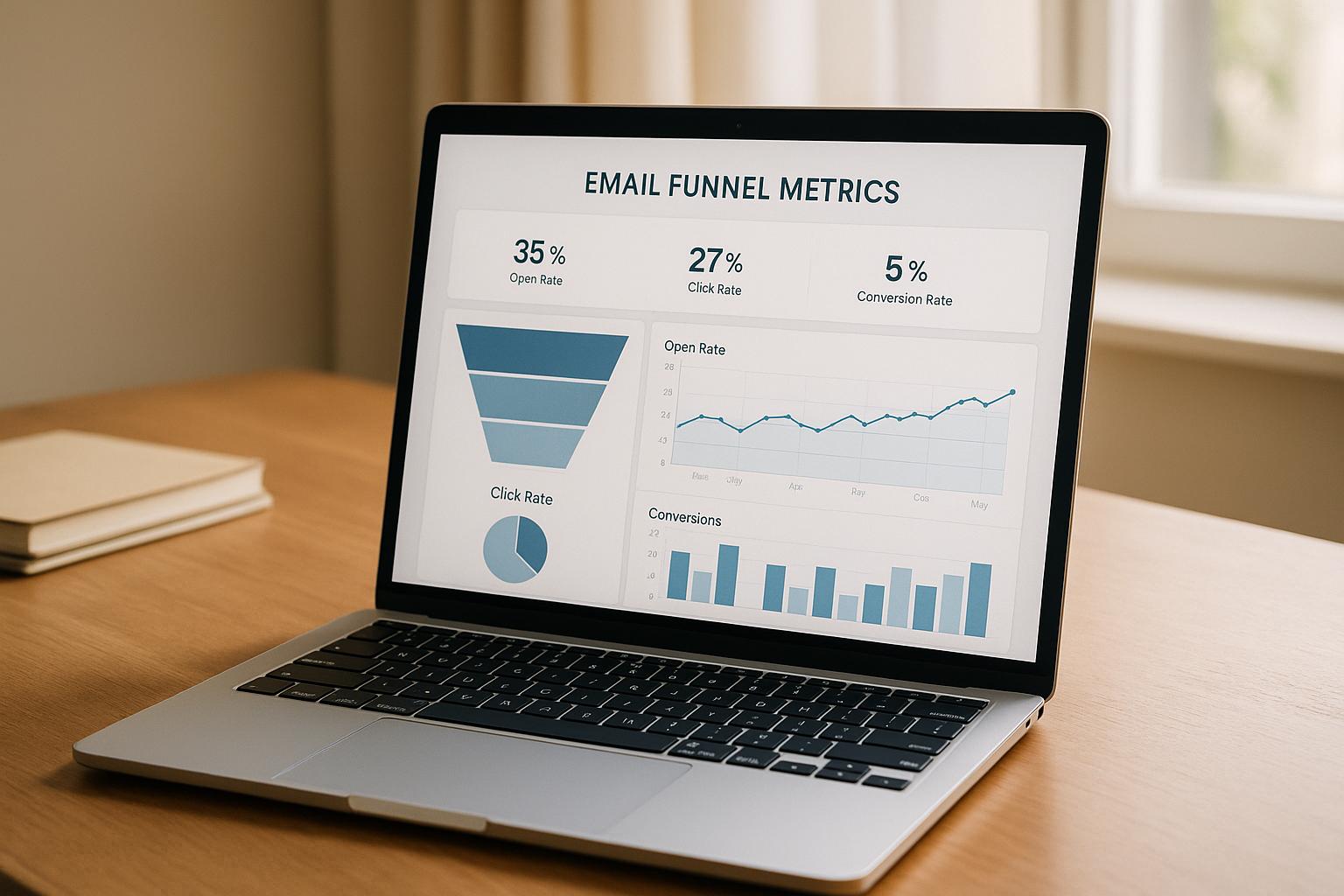
Conversion Rate by Funnel Stage
Conversion rates are the bread and butter of funnel analysis. They show where prospects are progressing and where they’re stalling, giving you clarity on which stages need attention.
Here’s how B2B businesses typically measure up:
- Lead to Marketing Qualified Lead (MQL): 25% to 35%
- MQL to Sales Qualified Lead (SQL): 13% to 26%
- SQL to Opportunity: 50% to 62%
- Opportunity to Close: 15% to 30%
For e-commerce, the benchmarks look different. Average conversion rates in the U.S. hover between 2.5% and 3%. Landing pages perform slightly better with a 4.02% conversion rate, while freemium models convert at 3% to 6%. Opt-out free trials tend to shine, achieving 50% to 60% conversion rates compared to opt-in trials at 10% to 25%.
The formula for calculating conversion rate is straightforward:
Conversion Rate = (Completed Actions / Total Entrants) × 100
For example, if 1,000 visitors land on your product page and 45 make a purchase, the conversion rate is 4.5%.
A great example of stage-specific optimization comes from Princess Polly. In 2024, the Australian fashion brand partnered with Yotpo to integrate user-generated content into Google ads. The result? Over 300,000 reviews collected, a 112% jump in average order value, and a staggering 498% boost in conversion rates.
Drop-off Rate
While conversion rates show progress, drop-off rates highlight where potential customers are leaving the funnel. This metric pinpoints bottlenecks and quantifies the impact of each stage’s challenges. The drop-off rate is calculated by comparing adjacent stages or looking at overall funnel exits.
High drop-off rates often point to issues like technical glitches, unclear messaging, or a poor user experience. For instance, cart abandonment remains a common problem, with rates ranging from 56% to 81% and averaging around 70%.
To make the biggest impact, focus on improving stages with the highest drop-off rates first. Even small tweaks at major bottlenecks can lead to noticeable gains in overall funnel performance.
Customer Acquisition Cost (CAC) and Lifetime Value (LTV)
The balance between Customer Acquisition Cost (CAC) and Lifetime Value (LTV) is a critical measure of a business’s long-term health. CAC tells you how much it costs to acquire a customer, while LTV measures the total revenue a customer generates over time. A healthy ratio is 3:1, meaning each customer should bring in three times the revenue of their acquisition cost.
This balance is becoming harder to achieve, as CAC has surged by 222% over the last eight years. However, retaining customers is far more cost-effective - 6 to 7 times cheaper than acquiring new ones. Loyal customers also spend 67% more than new ones.
Bain & Company research shows that increasing customer retention by just 5% can boost profits by 25% to 95%. Additionally, loyal customers are 50% more likely to try new products and spend 31% more than first-time buyers.
"The LTV CAC ratio is a key indicator of your business's profitability and scalability. It tells you whether the value you can deliver for each customer exceeds what you spend to acquire them." - Josephine Cheng
To maximize profitability, track CAC and LTV by customer segment. Some segments may justify higher CAC due to higher LTV, while others might need different strategies to improve efficiency. This insight helps fine-tune your approach to customer acquisition and retention.
| eCommerce Funnel Stage | Key KPIs to Track |
|---|---|
| Awareness | Audience reach, new users, product page views |
| Consideration | Returning users, customer reviews, comparison page visits |
| Conversion | Cart additions, checkout rates, abandoned cart recoveries, average order value |
| Post-purchase | Revenue from repeat customers, referral revenue |
Data Visualization Techniques
Turning complex funnel data into clear, actionable insights is the goal of effective data visualization. By revealing patterns and highlighting bottlenecks, the right visualization methods can make a world of difference. Whether you're analyzing overall conversion trends or diving into specific user behaviors, selecting the appropriate approach is key.
Here’s a look at some powerful chart types that can transform raw data into meaningful insights.
Multi-Stage Funnel Charts
Funnel charts are the go-to choice for visualizing how customers move through sequential stages. They’re excellent at showing progression and identifying where drop-offs occur. Ideally, a funnel chart should include 3 to 7 stages, balancing clarity with enough detail to be insightful.
Bar charts, particularly stacked bar charts, are another option for comparing stages directly. If you need to clearly compare different stages, bar-style funnel charts might be the better choice.
To make your funnel charts more effective, use color strategically to highlight problem areas and adjust the layout to emphasize critical insights. Combining funnel charts with line or standard bar charts can also add context, helping you understand overall trends.
Cohort Analysis and Segmentation
Cohort analysis takes static funnel data and turns it into a dynamic view of customer behavior over time. By grouping users based on shared traits - like acquisition dates or demographics - you can uncover which segments perform best. This can also reveal differences in retention and churn rates. Tools like cohort graphs, heatmaps, and line charts make it easier to spot trends and anomalies across groups.
These insights are incredibly useful for identifying high-value customers, at-risk groups, or upselling opportunities. With this information, you can tailor your messaging, offers, and promotions to better match each cohort’s needs, ultimately driving engagement and improving conversion rates.
Heatmaps and Sankey Diagrams
Heatmaps are a great way to visualize patterns in your funnel data using color intensity. They’re particularly useful for showing user interaction patterns and highlighting areas that need attention. By simplifying complex datasets into easy-to-understand visuals, heatmaps make it quicker to grasp key insights.
Sankey diagrams take things further by showing how users flow through your funnel. With their ability to depict multiple input sources and output paths, they make drop-off points easy to spot. The thickness of each flow line corresponds to the volume of users, providing a clear visual of where people are falling off.
For the best results, use Sankey diagrams to track transitions between stages and identify where users are dropping off. When combined with other visualization tools, they offer a comprehensive view of user behavior.
These visualization tools lay the groundwork for creating customized dashboards that integrate real-time data and metrics tailored for U.S. audiences.
| Funnel Stage | Optimization Strategy |
|---|---|
| Awareness | Create targeted content to attract the right audience |
| Consideration | Build trust with testimonials and reviews |
| Conversion | Simplify the checkout process and improve CTAs |
| Loyalty | Engage users with personalized content and rewards |
For more guidance, check out the Marketing Funnels Directory. They provide tools and resources that can help businesses improve their customer journey using advanced data visualization and funnel analysis techniques.
sbb-itb-a84ebc4
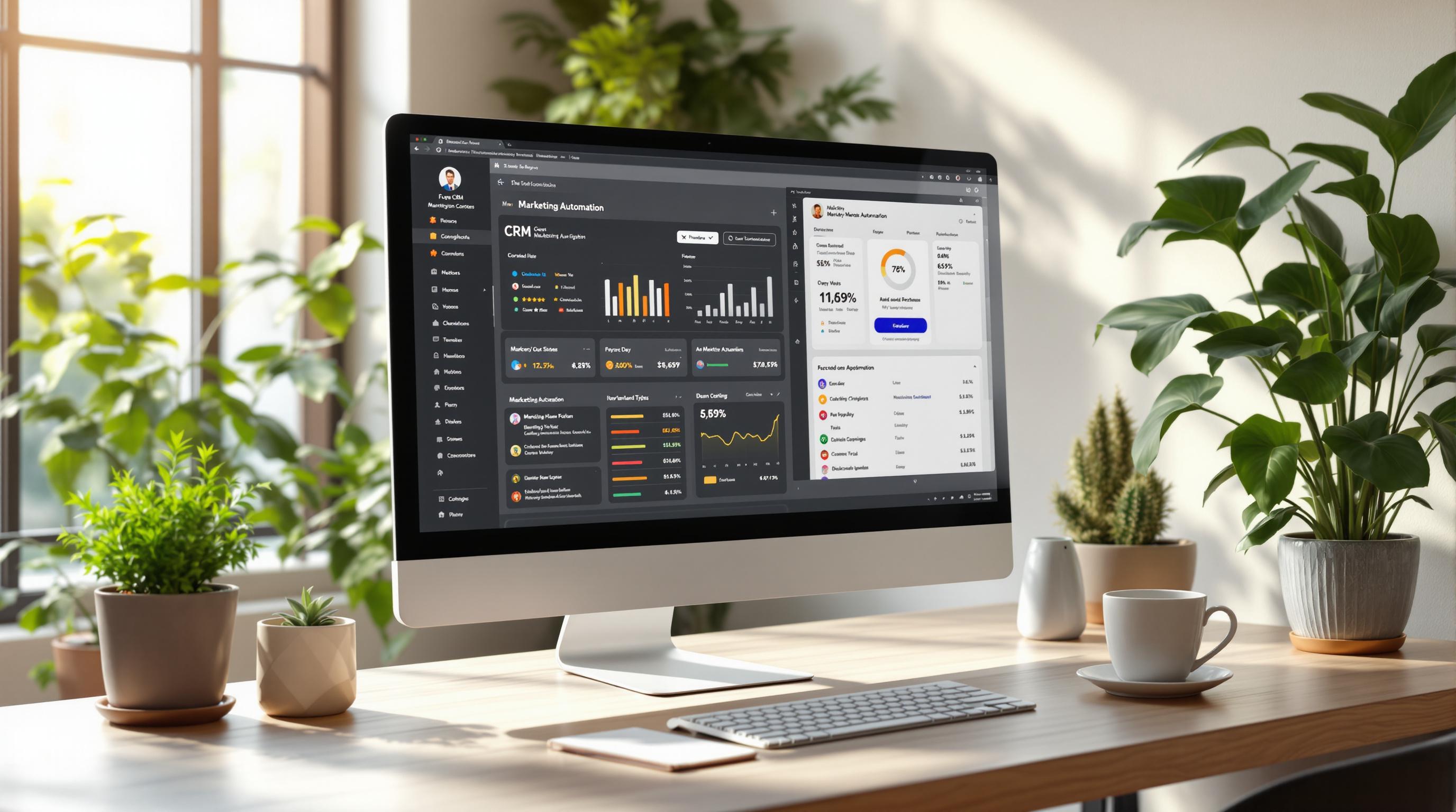
Building and Customizing Funnel Dashboards
Creating effective funnel dashboards goes beyond simply connecting data sources and throwing in a few charts. The real magic lies in thoughtful integration, smart customization, and formatting that transforms raw data into insights your team can act on immediately. Let’s break down how to design dashboards that deliver real value.
Integrating Tools and Real-Time Data
Modern dashboards thrive on real-time data. But to make that work, you need solid planning and a reliable technical setup. The quality of your data is everything - if it’s not accurate, timely, or relevant, your dashboard won’t be much help. And the stakes are high: poor data quality costs businesses an average of $12.9 million annually due to bad reporting.
To avoid this, automate the process with ETL (Extract, Transform, Load) tools. These tools handle data gathering, cleaning, and transformation, ensuring your dashboard stays current and error-free. Plus, don’t forget about data privacy - use techniques like assessments, minimization, and tokenization to protect sensitive information.
Your dashboard should be designed to answer three key questions at a glance:
- Is everything running smoothly?
- Is there a problem that needs fixing?
- Is there a success worth celebrating?
By focusing on these questions, your team can make faster decisions and stay aligned with your strategic goals. Once you’ve nailed the integration, it’s time to focus on customization and layout.
Custom Metrics and Layout Optimization
Custom metrics are what take your dashboard from generic to game-changing. By building metrics tailored to your needs, you can pull data from multiple sources into meaningful insights. Pair this with an optimized layout, and you’ll be able to spot performance gaps in seconds. For example, monitoring how prospects move through the sales funnel can highlight exactly where potential customers drop off.
"Funnelytics gave us clarity we never had before. We discovered exactly where customers were dropping off and fixed a critical checkout issue – boosting our conversion rate 20% in weeks." – Bren Higuera, Digital Advertising Manager
When designing your dashboard, choose sales metrics and KPIs that help you quickly identify issues. Customize metric blocks to suit your team’s needs. Tools like visual funnel mapping provide a clear overview of the customer journey, while heatmaps can show how users interact with your pages, pinpointing areas of interest or friction. And don’t underestimate the power of clear, page-specific calls to action (CTAs) to guide users effectively.
For the best user experience, stick to these design principles:
- Keep visuals consistent and simple.
- Use hierarchy - adjust size, color, or position - to prioritize information.
- Make insights actionable with annotations, alerts, filters, and drill-down options.
Also, ensure your dashboard works well across devices and uses color palettes that are accessible for color-blind users. With a solid design in place, the next step is to align your dashboard with U.S. formatting standards.
Adopting US-Specific Formats
To make your dashboards easier to understand for U.S. teams, stick to familiar formats. Use dollars with two decimals for currency (e.g., $1,234.56), present dates as MM/DD/YYYY or 'Month DD, YYYY,' and include commas for thousand separators. Proper formatting not only reduces errors but also ensures your team spends less time interpreting data and more time acting on it.
For more guidance on building effective marketing funnels and advanced dashboard techniques, check out the Marketing Funnels Directory. It’s packed with resources to help you improve your data visualization game and get the most out of your dashboards.
Dashboard Features and Optimization Strategies
Once your dashboard is set up, its advanced features can provide insights that go beyond historical data. The best dashboards not only summarize past performance but also help you anticipate trends, catch potential issues early, and explore your data to uncover opportunities you might have missed.
Predictive Analytics and Forecasting
Predictive analytics turns your dashboard into a forward-thinking tool. Instead of just reflecting on past results, it helps you forecast customer behavior, predict demand, and fine-tune your marketing strategies to stay ahead of the curve. Fast-growing companies, for instance, generate 40% more of their revenue through personalization compared to slower-growing competitors.
AI-powered tools play a key role here by enabling real-time monitoring. This allows you to adjust campaigns on the fly and get the most out of your marketing budget. Predictive analytics shines in areas like personalized marketing, customer segmentation, and demand forecasting. These capabilities can boost ROI, enhance customer loyalty, and speed up decision-making.
To complement forecasting, real-time alerts provide an extra layer of responsiveness to emerging challenges.
Automated Alerts and Anomaly Detection
Automated alerts keep you informed whenever critical metrics hit pre-set thresholds. By setting up alerts for key performance indicators - like campaign reach, engagement rates, conversion rates, and ROI anomalies - your team can focus on strategy while the system monitors performance in the background. This instant feedback can help you address problems before they spiral, saving both time and money.
"AgencyAnalytics is a great tool to automate reporting to save time and reallocate that time towards real implementation work to improve campaigns and overall KPIs." - Dennis Dimka, CEO, Uptime JurisPage
Platforms like Singular take this further by offering alerts for a wide range of metrics, from impressions and clicks to app installs and custom KPIs. The trick is to set thresholds that are precise enough to catch real issues without triggering unnecessary false alarms.
But alerts are just one piece of the puzzle - drill-down analysis takes performance monitoring to the next level.
Detailed Drill-Down Analysis
While surface-level metrics provide a snapshot, drill-down analysis digs deeper to uncover the "why" behind the numbers. This transforms your dashboard from a simple reporting tool into a powerful resource for actionable insights.
Drill-down analysis can pinpoint the root causes of trends or anomalies. For example, instead of just noting a drop in conversions, a deeper dive might reveal that the issue is tied to a specific user group or timeframe.
Take Sainsbury's as an example. They discovered that nearly half of their customers - 47.7% - were abandoning their carts at checkout. Digging deeper, they found a technical glitch preventing customers from selecting in-store pickup. Fixing this issue helped them recover over $260,000 in lost revenue per quarter.
When designing drill-down features, prioritize user-friendly navigation. Use clear, action-oriented labels like "View Paid Media Details" or "Performance by Campaign", keep navigation elements consistent, and include breadcrumbs so users can easily retrace their steps.
For more advanced resources on funnel analytics and dashboard optimization, check out the Marketing Funnels Directory. It offers tools, courses, and expert advice to help you take your analytics to the next level.
Conclusion
Funnel dashboard metrics are now at the heart of strategic growth. The data paints a clear picture: 77% of B2B CMOs feel the pressure to prove campaign ROI, and 87% face challenges in measuring long-term campaign impact. In today’s data-driven world, the ability to track and interpret precise metrics is more important than ever.
When metrics are used effectively, they unlock valuable insights that go beyond surface-level tracking. This approach enables businesses to fully harness the power of their data. As Christopher Van Mossevelde, Head of Content at Funnel, puts it:
"A well-designed dashboard ecosystem transforms marketing from reactive to strategic. When your dashboards are thoughtfully designed and interconnected, they create a shared language across teams where every decision is driven by clarity, not guesswork".
This shift from reactive to strategic thinking delivers tangible results. Businesses that embrace comprehensive funnel tracking can spot bottlenecks early, optimize resource allocation, and strengthen collaboration between sales and marketing teams through shared metrics.
The real value lies in recognizing that dashboards are living systems - tools that influence both day-to-day decisions and long-term strategies. Leading marketers are already adapting: 89% now rely on strategic metrics like gross revenue, market share, and customer lifetime value to measure campaign success. Meanwhile, 78% have updated their metrics in recent years to align with shifting business priorities.
Staying competitive requires constant refinement. Businesses need to commit to regular review sessions, leverage A/B testing to validate changes, and create feedback loops where data analysis feeds directly into actionable improvements. This continuous process ensures their strategies remain effective in an ever-evolving market.
For those ready to elevate their funnel analytics, the Marketing Funnels Directory offers tools, courses, and expert resources to help refine marketing funnels and optimize the customer journey from awareness to conversion.
Ultimately, the organizations that succeed are those that treat their funnel dashboards as essential systems - guiding every marketing decision with confidence and clarity.
FAQs
How can businesses use advanced dashboard metrics to identify and fix bottlenecks in their marketing funnels?
Businesses can tap into advanced dashboard metrics to uncover and fix bottlenecks in their marketing funnels. By analyzing key performance indicators (KPIs) - like conversion rates, user drop-off points, and engagement levels at various funnel stages - they can identify exactly where potential customers lose interest or exit the process.
Tools like funnel charts and analytics dashboards make it easy to visualize and track these metrics in real time. When a specific stage shows a high drop-off rate, businesses can take targeted action. This might mean tweaking messaging, enhancing the user experience, or introducing incentives to keep users engaged. These adjustments can streamline the customer journey, improve conversion rates, and make operations more efficient.
How can real-time data and predictive analytics enhance funnel dashboards to improve marketing strategies?
Integrating real-time data and predictive analytics into your funnel dashboards can take your marketing efforts to the next level. Real-time data offers immediate insights into customer behavior and market trends, letting you respond quickly, streamline operations, and create more tailored customer experiences.
Adding predictive analytics to the mix helps you stay ahead by forecasting customer needs, fine-tuning lead scoring, and preparing for shifts in the market. When used together, these tools empower businesses to make smarter, forward-thinking decisions. The result? Campaigns that hit the mark with precision, better outcomes, and a more flexible, responsive marketing approach.
How do tools like funnel charts, heatmaps, and Sankey diagrams help analyze customer behavior in each stage of the funnel?
Visualization tools like funnel charts, heatmaps, and Sankey diagrams help break down customer behavior across different funnel stages by turning raw data into clear, visual insights.
- Funnel charts illustrate how users move through each funnel stage, pinpointing where drop-offs happen and signaling areas that need attention to improve conversions.
- Sankey diagrams map out customer flows between stages, uncovering patterns and pathways that might be hard to spot in standard data sets.
- Heatmaps show where users interact most on websites or apps, highlighting areas of strong engagement or potential friction, so you know exactly where to refine key touchpoints.
By translating complex data into visuals, these tools make it easier to act quickly and effectively to enhance the customer experience and boost conversion rates.