Your mobile landing page can make or break your conversions. With mobile devices driving 82.9% of all landing page traffic, optimizing for speed, usability, and clarity is non-negotiable. Here's how to get it right:
- Page Load Speed: 53% of users leave if a page takes over 3 seconds to load. Compress images, use a CDN, and minimize JavaScript for faster performance using top marketing funnel software.
- Clear Headlines: Short, direct headlines (3–4 words) grab attention. Focus on benefits, not features, and keep them above the fold.
- Thumb-Friendly Design: Make buttons large (60–72 pixels) and place CTAs in thumb zones for easy navigation.
- Simplify Forms: Reduce fields to essentials, enable autofill, and use smart input types to improve usability.
- Above-the-Fold Content: Place key elements like headlines and CTAs where users see them immediately.
- Limit Distractions: Remove unnecessary navigation links to keep users focused on your primary CTA.
- Track and Test: Use analytics and A/B testing to identify and fix problem areas, ensuring a better user experience.
Key takeaway: Faster, simpler, and user-focused pages convert better. Even small tweaks, like reducing load time or simplifying forms, can significantly boost results.
How To Build High Converting MOBILE Landing Pages!
sbb-itb-a84ebc4
1. Keep Page Load Speed Under 3 Seconds
Page speed is a big deal - slow-loading pages can seriously hurt conversions. Mobile users, in particular, expect pages to load almost instantly. A delay of just one second can slash conversions by 7%, and in retail, that number climbs to a staggering 20% for mobile conversions.
"In retail, we've seen that a 1-second delay in mobile can impact mobile conversions by up to 20 percent." - Google Ads Help
The longer your page takes to load, the worse it gets. A page that loads in 5 seconds instead of 1 can see a 90% increase in bounce rates. Stretch that to 6 seconds or more, and the bounce rate skyrockets by 106%. Mobile devices, with their slower processors and less reliable connections, make optimizing every kilobyte even more critical.
Here’s how to speed things up:
- Compress Images: Switch to formats like WebP or AVIF, which are 30%-50% smaller than JPEGs without losing quality.
- Minimize File Sizes: Use Gzip or Brotli to shrink HTML, CSS, and JavaScript files by 70%-90%. Brotli is especially effective, offering 15%-20% better compression for text-based files compared to Gzip.
- Use a CDN: Tools like Cloudflare or Amazon CloudFront deliver your content from servers closer to your users, cutting down on latency and improving your Time to First Byte (TTFB). Aim for a TTFB of less than 800 milliseconds.
Don’t forget to tackle JavaScript. Reduce its impact by deferring non-essential scripts and eliminating unused code. JavaScript is resource-heavy on mobile devices - it needs to be downloaded, parsed, compiled, and executed, all of which delays user interactions.
Once your page speed is optimized, you’ll have a solid foundation to work on other elements like crafting a clear and compelling headline to boost mobile conversions even further.
2. Write a Clear, Direct Headline
After optimizing for speed, the next step to mobile success is crafting a headline that grabs attention instantly.
Your headline is the first thing mobile users notice and can influence up to 90% of your conversions. With just 8.25 seconds to make an impression, there's no room for vague promises or overly clever wordplay.
Keep it short and focused. While some suggest 10 words, shorter headlines - just three to four words - work best for mobile screens. A 12-word headline could wrap into seven lines on a smartphone, potentially pushing your call-to-action out of sight. Since over 57% of user attention stays on the first screenful of content, every word needs to earn its spot.
"Skip the clever wordplay. Ditch the cute puns. Your headline needs to do one of three things in under ten words: Call out their exact pain point... Promise a specific, tangible outcome... [or] Trigger curiosity without being vague." - Kainat Khan, Conversion Copywriter
Focus on benefits, not features. Proven headline formulas like "Benefit + Timeframe" (e.g., "Increase ROAS by 40% in 30 Days") or "Problem + Solution" (e.g., "Tired of Wasted Ad Spend? Here's the Fix") can be highly effective. Also, ensure your headline aligns with the ad copy to reduce confusion and bounce rates.
Position your headline above the fold - ideally within the top 100 pixels - and use a font size of at least 16px so users don’t have to zoom in. Testing different headlines or using AI-powered copywriting tools can help you find the one that resonates best.
When your headline is clear, direct, and benefits-driven, your mobile landing page is set up to engage users and drive conversions.
3. Design Buttons and CTAs for Thumb Navigation
After grabbing attention with your headline, your call-to-action (CTA) needs to keep users engaged - and it should be designed with thumb navigation in mind.
Here’s why: Over 75% of smartphone users operate their devices with one hand, relying heavily on their thumbs. When buttons are too small, poorly spaced, or awkwardly positioned, users struggle to tap accurately. Research shows that touch targets smaller than 48 pixels can increase tap errors by 60%.
Make buttons the right size. Both Apple and Google suggest minimum touch targets of 44×44 pixels and 48×48 pixels, respectively, but aiming for 60–72 pixels often delivers the best results. Considering that the average fingertip measures 0.6 to 0.8 inches and the thumb’s impact area can reach up to 1 inch, slightly larger buttons can make a world of difference. Case studies even show that increasing button sizes can boost conversions by as much as 20%.
Spacing is just as important. To avoid accidental taps, leave at least 12 to 48 pixels of space between interactive elements. Buttons placed too closely together can lead to frustrating errors, often referred to as "fat-finger" mistakes. For example, SimScale Energy’s landing page nailed it with a perfect 100/100 Mobile CTA Interaction Ease score by ensuring ample spacing and clear touch areas. On the flip side, Huawei Mate X3’s landing page scored only 33/100 due to a poorly positioned, undersized "Buy" button.
"If users can't tap a button comfortably, that conversion is lost." - Atticus Li, Experimentation Lead, NRG Energy
Position CTAs in the thumb zone. Thumbs naturally rest in the lower-middle and bottom areas of the screen during one-handed use. This makes these zones prime real estate for your primary CTA. Consider using a sticky button that stays visible as users scroll. Avoid placing key actions in the top corners, which force users to adjust their grip or use both hands. A full-width, eye-catching primary CTA works well here, while secondary buttons should stay smaller but still meet minimum size guidelines.
4. Reduce Form Fields and Improve Input Design
When users are ready to act, don’t let a poorly designed form stand in their way. The numbers don’t lie: 81% of mobile users abandon forms they find too lengthy. Even necessary forms can scare users off if they look overwhelming.
Fewer fields mean better results. Cutting down form fields from four to three can boost conversions by nearly 50%. On mobile, every extra field beyond eight can lower conversions by 3-7%. Ask yourself: is this field essential, or just nice to have? If it’s not critical, get rid of it. Streamlined forms make it easier for users to complete them. This is a critical step when you build a profitable online business through optimized conversion paths. For instance, combine "First Name" and "Last Name" into a single "Full Name" field or use a single address lookup instead of multiple lines.
Here’s how you can simplify form design and make input easier for users.
Use smart input types to make typing easier. The right HTML5 input attributes can save users up to 40% of typing effort. For example:
type="email"brings up a keyboard with @ and .com keys for email fields.type="tel"displays a numeric keypad for phone numbers.inputmode="numeric"provides a clean number pad for ZIP codes or quantities.
These small adjustments reduce the need for users to switch keyboards, making the process faster and less frustrating.
Enable autofill to save time. Autofill features can cut form abandonment by 75% and reduce completion time by up to 35%. Add standard autocomplete attributes like autocomplete="name", autocomplete="email", and autocomplete="street-address" to allow browsers to fill out fields instantly. Plus, autofilled entries are 25% less error-prone than manually typed ones. This not only speeds up the process but also improves accuracy.
Design labels and fields for mobile usability. Place labels above input fields to ensure they remain visible when the keyboard pops up. Avoid using placeholder text as the only label - it disappears when users start typing, which can confuse them. Use a font size of at least 16 pixels for input text to prevent iOS browsers from zooming in unnecessarily. Also, make sure your input fields follow mobile touch guidelines for a smoother user experience.
5. Place Key Content Above the Fold
Did you know visitors form an opinion about your page in just 3 to 6 seconds? That means the content above the fold - the part of the page visible without scrolling - has to work hard to grab their attention. In fact, this section captures 84% more attention and accounts for 57% of viewing time. If your headline or call-to-action (CTA) isn’t immediately visible, you risk losing potential customers before they even engage.
Here’s the key: the goal in those first few seconds isn’t to make a sale - it’s to build enough trust to keep visitors scrolling, often by using an all-in-one marketing platform to maintain brand consistency. As Waseem Bashir, CEO of Apexure, explains:
"Above the fold does not need to close the deal. It needs to earn the scroll."
Make Your Headline Work for You
Your headline should align with the visitor’s entry point. Doing so can increase conversions by 20–35%. Think of it as setting the stage for the rest of your page, ensuring visitors are intrigued enough to explore further.
Avoid Oversized Hero Images
Large hero images may look impressive, but they can actually hurt your page’s performance. Limit them to 40–50% of the viewport height. Why? Oversized visuals can push important elements like your CTA out of sight. For example, in February 2026, Codivox audited a SaaS company and found their CTA buried three swipes down on mobile. This layout resulted in a 2.1% conversion rate. By moving the CTA above the fold and tweaking the headline, they boosted conversions to 4.8% in just three weeks.
Optimize Your CTA Placement
Where should your primary CTA go? Place it in the center or lower-middle of the screen - right where thumbs naturally rest. Use high-contrast colors to make it pop instantly. A well-placed, eye-catching CTA can make all the difference.
Add Trust Signals
Don’t forget to include trust signals near your CTA. Social proof elements like client logos or star ratings can increase conversions by 15–30% when placed above the fold. These small touches help reassure visitors and encourage them to take the next step.
6. Remove Unnecessary Navigation Elements
Every extra link on your mobile landing page is a potential distraction - and distractions can cost you conversions. Imagine a visitor landing on your page and being greeted by a full menu with links like "About Us", "Blog", or "Careers." Instead of staying focused, they might wander off. The numbers back this up: sites that don't meet mobile usability standards see 38% higher bounce rates and 24% lower conversion rates.
Think of your landing page like a direct conversation. If you're making a sales pitch, you wouldn't suddenly point someone toward ten other options, would you? The same logic applies here. As LandingPageFlow explains:
"A high-converting mobile landing page should have a clear, singular focus. Avoid overwhelming users with multiple CTAs, which can dilute your message and confuse the user."
This idea ties into Hick's Law, which states that fewer choices lead to quicker decisions. By cutting out unnecessary navigation, you’re not just tidying up - you’re making it easier for users to act. If secondary links are absolutely necessary, consider using a collapsible hamburger menu, but keep your primary call-to-action (CTA) front and center. Streamlining your page this way aligns perfectly with the earlier advice to make your main CTA the star of the show.
Here’s another key point: 67% of mobile interactions happen one-handed. Cramming navigation links too close together often leads to accidental clicks, frustrating users. To avoid this, ensure that interactive elements are at least 44x44 CSS pixels with 8 pixels of spacing between them. This simple tweak reduces "fat-finger" errors and keeps users engaged instead of annoyed.
7. Use Analytics and Heatmap Tracking
Analytics tools and heatmaps are essential for understanding how mobile users interact with your landing page. They help identify problem areas and provide actionable insights to improve performance. As Leona Henryson, a UX specialist at EssaySupply, puts it:
"Google Analytics is an incredibly powerful tool you can make use of to measure landing page's performance and fine-tune any element if needed."
Start by using Google Analytics to monitor key metrics like session duration, bounce rate, and goal completions. Segment mobile traffic from desktop to uncover specific performance gaps. For example, if your mobile conversion rate is trailing desktop by over 30%, it’s a clear red flag for mobile-specific issues. Reports like Site Speed (with "Device Category" as a secondary filter) and Screen Resolution can help you detect slow-loading pages or layout problems on certain devices.
Heatmaps take this a step further by offering a visual representation of user behavior. For mobile, tap maps show exactly where users interact with the screen. If users frequently tap on static images or text that look like buttons, consider making these elements interactive or redesigning them to avoid confusion. Similarly, scroll maps can reveal if users abandon the page before reaching your call-to-action. This might indicate that the page is either too lengthy or that the content above the fold isn’t compelling enough.
A great example of heatmap insights in action comes from Original Grain. By reorganizing their site using revenue-per-click data from heatmaps, they increased revenue per session by 17% and saw a 43% uptick in traffic.
To further refine the mobile experience, set up event tracking for actions like form submissions, video plays, and scrolling. Pay attention to rage clicks, where users repeatedly tap unresponsive elements, as these indicate frustration. By combining analytics, heatmap data, and simplified navigation strategies, you can create a mobile experience that’s both efficient and conversion-friendly.
8. Apply Mobile SEO Best Practices
Mobile SEO is a must-have. Since July 2024, Google has fully adopted mobile-first indexing, which means the mobile version of your site is what gets crawled and ranked. If your content is desktop-only, Google won't even notice it. With mobile devices projected to drive 62% of global web traffic in 2025, ensuring your site performs well on mobile is key for both visibility and conversions.
Start by setting up your page for consistent mobile performance. Add the viewport meta tag to your header: <meta name="viewport" content="width=device-width, initial-scale=1.0">. Avoid disabling user scaling, as it can create accessibility issues and lead to usability errors flagged in Google Search Console. For metadata, keep title tags between 50–60 characters with primary keywords upfront, and limit meta descriptions to under 120 characters to prevent truncation.
Next, focus on responsive design, which Google recommends because it uses a single URL and codebase. This approach simplifies crawling and avoids common pitfalls like incorrect canonical tags or duplicate content from separate mobile and desktop sites. Ensure that your mobile site mirrors the desktop version in terms of primary content, headings, and internal links. While hidden content in accordions or tabs is indexable, anything requiring JavaScript to "load more" could be overlooked.
Core Web Vitals are critical ranking factors, measured specifically for mobile users. Aim for these benchmarks:
- Largest Contentful Paint (LCP): under 2.5 seconds
- Interaction to Next Paint (INP): under 200 milliseconds
- Cumulative Layout Shift (CLS): under 0.1
To improve LCP, preload key images in modern formats like WebP or AVIF. Keep your site responsive by optimizing JavaScript execution to meet INP requirements. Also, avoid intrusive interstitials, such as full-screen pop-ups that block content on arrival - Google penalizes these on mobile.
Finally, use structured data with identical JSON-LD markup on both mobile and desktop versions to qualify for rich results. Focus on key schema types like Breadcrumb, Product, and LocalBusiness, especially if local searches are part of your strategy. Did you know that 76% of local mobile searches lead to a store visit within 24 hours? This makes local SEO a powerful tool for driving foot traffic to your physical locations.
9. Run A/B Tests and Adjust Based on Data
Improving mobile conversions is a process that never really ends. It requires constant testing and tweaking based on hard data. This is where A/B testing becomes crucial - it helps refine key aspects like page speed, design, and form usability.
Start by focusing on high-impact elements like headlines, CTA buttons, hero images, and form length. These areas often yield the biggest improvements. In fact, landing page tests have a 50% win rate and can boost conversions by an average of 8.7%. To get meaningful results, test one variable at a time. For example, if you change both your headline and the color of your CTA button, you won’t know which one made the difference.
"Simplification wins more often than addition. Tests that reduce friction, remove unnecessary elements, or streamline the user flow outperform tests that add new content." - GrowthLayer
Keep your testing approach methodical and focused. Run each test for at least 2–4 weeks with 1,000–5,000 visitors per variation to ensure reliable results, ideally achieving a 95% confidence level. Cutting tests short can lead to misleading conclusions, doubling the likelihood of false positives. While tracking your primary conversion metric (like purchases or trial signups), don’t forget to monitor micro-conversions, such as CTA clicks, form starts, or video views. These smaller metrics can reveal where users lose interest.
The value of testing tailored to mobile users is clear. For instance, in 2025, the fishing community Salt Strong used OptinMonster to launch a mobile-only exit-intent popup. By designing a template specifically for mobile visitors, they achieved a 3.8% conversion rate. This underscores the importance of mobile-specific testing. Purpose-built mobile experiences tend to outperform responsive desktop layouts, with a 38% win rate. Consider experimenting with elements like first-person CTA copy (“Start My Free Trial” vs. “Start Your Free Trial”), contrasting button colors, or multi-step forms compared to single-step layouts.
These strategies can help you uncover what truly resonates with your audience.
10. Find Tools in the Marketing Funnels Directory

Creating a successful mobile landing page starts with having the right tools at your fingertips. The Marketing Funnels Directory is a one-stop shop for resources tailored to enhance mobile landing pages and fine-tune your entire marketing funnel.
This directory includes tools to put all the mobile best practices we’ve covered into action. For instance, mobile-first landing page builders like SeedProd, Unbounce Smart Builder, FlexiFunnels, and Fibr AI provide dedicated mobile preview and editing features. You’ll also find conversion tools such as OptinMonster, which offers mobile-optimized popups and exit-intent technology. These tools deliver real results: ChinaImportal saw an 18% boost in total leads after using mobile-focused lead generation tools, and The Advisor Coach tripled their sitewide conversions with mobile-specific popup templates.
Performance optimization tools are also part of the mix. Image compression resources like TinyPNG, WebP converters, and Content Delivery Networks (CDNs) help ensure your pages load in under three seconds. Testing tools such as Google PageSpeed Insights and Unbounce's Landing Page Analyzer can pinpoint speed issues. On top of that, communication plugins like WP Call Button add click-to-call functionality, making it easier for mobile users to connect with you instantly.
For forms, the directory includes options like WPForms, which simplifies creating responsive forms with fewer fields - key for boosting completion rates on mobile touchscreens. With mobile devices accounting for 68.1% of global website visits and the U.S. mobile shopping market continuing to grow, having these tools isn't just helpful - it’s critical for keeping up with the competition.
Whether you need AI-driven automation, A/B testing platforms, or funnel-building software, this directory brings everything together. It’s a practical resource to help you implement the mobile optimization strategies we’ve discussed and improve mobile conversions efficiently.
Comparison Table
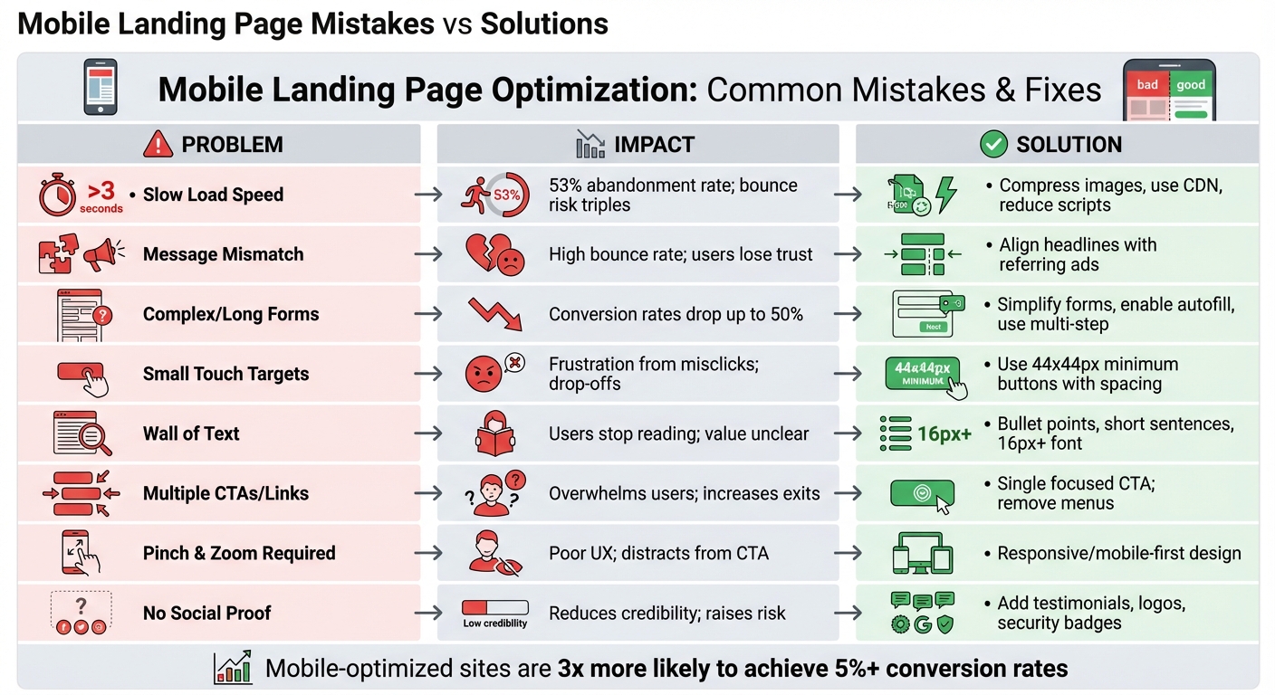
Mobile Landing Page Mistakes vs Solutions: Impact on Conversion Rates
Mobile landing pages often fail for predictable reasons, but the good news is that each issue has a clear solution. By understanding what’s broken and how to fix it, you can focus on changes that directly improve conversions.
The table below outlines the most common mobile landing page mistakes and their practical fixes. These aren't just theoretical problems - 53% of mobile users abandon pages that take over three seconds to load, and long forms on mobile can slash conversion rates by up to 50% compared to desktop. Even small adjustments can lead to noticeable improvements.
| Mobile Landing Page Mistake | Impact on Conversions | Recommended Solution |
|---|---|---|
| Slow Load Speed (>3s) | 53% abandonment rate; bounce risk triples | Compress images, use a CDN, and reduce third-party scripts |
| Message Mismatch | High bounce rate; users lose trust | Align headlines and visuals with the referring ad |
| Complex/Long Forms | Conversion rates drop by up to 50% | Simplify forms, enable autofill, or use multi-step forms |
| Small Touch Targets | Frustration from misclicks; leads to drop-offs | Use buttons that are at least 44x44 pixels with enough spacing |
| Wall of Text | Users stop reading; value isn't communicated | Break text into bullet points, keep sentences short, and use a font size of at least 16px |
| Multiple CTAs/Links | Overwhelms users; increases navigation away | Stick to a single, focused CTA; remove menus and footers |
| Pinch and Zoom Required | Hurts user experience; distracts from the CTA | Implement responsive or mobile-first design that scales automatically |
| No Social Proof | Reduces credibility and raises perceived risk | Add testimonials, authority logos, or security badges |
These common issues emphasize how technical and design tweaks can directly affect your landing page’s performance. For instance, reducing page load time from 5 seconds to 1 second can triple conversion rates. By prioritizing these fixes, you can significantly enhance your mobile landing page’s effectiveness.
Conclusion
Optimizing your mobile landing pages isn’t just a one-time task - it’s a continuous process that directly impacts your bottom line. With mobile traffic leading the way in landing page visits, even small missteps like slow load times, extra form fields, or poorly placed CTAs can cost you valuable conversions.
Here’s a striking fact: mobile-optimized sites are three times more likely to achieve a conversion rate of 5% or higher. Even a modest 1% improvement in conversions can result in massive gains on high-traffic pages, all without spending an extra dime on ads.
"The brands winning in 2026 aren't the ones with the prettiest pages. They're the ones systematically testing, measuring, and improving based on data." - AdBid
This quote highlights the importance of using data-driven strategies to refine your mobile experience.
To stay ahead, focus on these key areas: prioritize page speed, simplify your forms, design with thumb-friendly navigation in mind, and test everything rigorously. Use tools like Core Web Vitals to monitor performance and analyze heatmaps to identify friction points. And remember, when running A/B tests, wait until you reach at least 95% statistical confidence before making changes. Since mobile SEO and user behavior are always evolving, regular audits are essential to catch and fix issues before they affect your rankings or conversions.
For additional support, check out the Marketing Funnels Directory. It’s packed with resources to help you create high-performing mobile experiences and successful marketing funnels. Small, consistent improvements to your mobile landing pages can lead to significant boosts in your overall conversion rates.
FAQs
What should I fix first if my mobile conversion rate is low?
If your mobile conversion rate isn't where you'd like it to be, it's time to take a closer look at the mobile user experience. Start with the basics: focus on load speed, design, and usability.
A fast-loading landing page is crucial - nobody wants to wait around for a sluggish site. Pair that with a clean, visually appealing design that grabs attention and guides users effortlessly. Finally, make sure everything works smoothly, from navigation to forms, so users can take action without frustration. These tweaks can make all the difference in turning visitors into customers.
Which metrics best show whether my mobile landing page is improving?
Key metrics worth keeping an eye on are conversion rate, page load speed, microconversions, and user engagement. These metrics can give you a clear picture of how your mobile landing page is performing and help pinpoint areas that could use some fine-tuning.
How can I A/B test mobile changes without hurting results?
To run A/B tests on mobile changes and get reliable insights, follow a clear and structured approach. Start by defining specific goals and hypotheses - what exactly are you trying to improve or learn? Then, divide traffic evenly - a common split is 50/50 - to ensure both variations are tested under similar conditions. Make sure your sample size is adequate, and let the test run for a sufficient duration to gather meaningful data.
It's crucial to isolate the changes you're testing. This way, you can avoid mixing variables that might skew your results. When analyzing outcomes, focus on statistically significant differences to avoid jumping to conclusions. Also, ensure your testing setup is SEO-friendly and thoroughly QA-verified to prevent technical hiccups that could disrupt the test or harm your site's performance.