Most mobile infographics fail for one simple reason: they’re designed like desktop graphics and then shrunk down.
If I want an infographic to work on a phone, I need to keep it vertical, short, lightweight, and easy to tap. That means one column, short copy, simple charts, compressed files, and testing on actual phones using top marketing funnel software. The article also points to hard performance targets like LCP under 2.5 seconds, CLS under 0.1, INP under 200 ms, and notes that 53% of mobile users leave pages that take more than 3 seconds to load.
Here’s the full checklist in plain English:
- Use one vertical column
- Keep text short and easy to scan
- Size images and icons for phone screens
- Make tap targets large enough
- Use simple charts with less data
- Export in light file formats like WebP or AVIF
- Cut file size to help load time
- Split long infographics into shorter sections
- Test on real devices and check accessibility
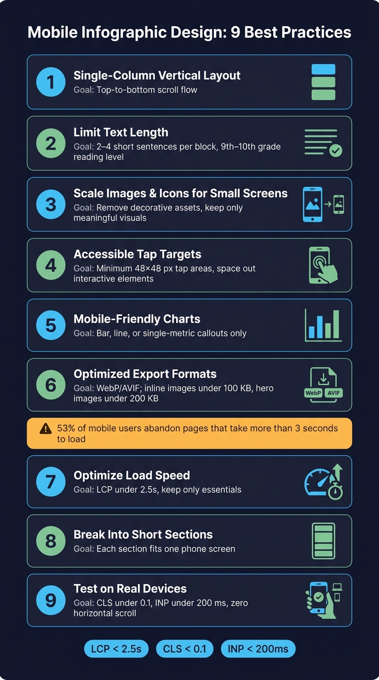
Mobile Infographic Design: 9 Best Practices at a Glance
14 Infographic Do's and Don'ts to Design Beautiful and Effective Infographics
sbb-itb-a84ebc4
Quick Comparison
| Practice | Main goal | What I’d focus on |
|---|---|---|
| Single-column layout | Easy scrolling | Top-to-bottom flow |
| Short text | Better reading on small screens | 2 to 4 short sentences per block |
| Small-screen visuals | Clean layout | Remove decorative assets |
| Tap targets | Better touch use | Space out links and buttons |
| Simple charts | Faster understanding | Bar, line, or single-number callouts |
| Mobile export | Smaller files | WebP/AVIF, compressed images |
| Load speed | Less waiting | Inline images under 100 KB, hero images under 200 KB |
| Short sections | Less scroll fatigue | Break long graphics into screen-sized parts |
| Device testing | Catch layout and access issues | Test on common phone sizes |
Bottom line: if I’m designing for mobile, I should start with the phone screen first, not treat it like the cut-down version of a desktop page.
Why Mobile Infographics Require a Different Design Approach
A design that looks fine on desktop can fall apart on mobile. The biggest limit is screen width. Multi-column layouts, tiny labels, and dense charts are much harder to read on a phone. That’s why mobile infographic design should start with a vertical layout, not a desktop design that’s been shrunk down.
Touch changes the rules too. It’s not enough to make buttons or text bigger. You also need more space between elements so people can tap without frustration. And once you deal with touch and spacing, the next issue shows up fast: load time.
Mobile users switch between Wi-Fi and cellular all the time. If the connection is slow, heavy visuals can drag. In those cases, keep only what matters most on the page. That’s speed-first design in practice.
People on mobile make decisions fast, so put the most useful information near the top. Before you design, check your analytics and see which device sizes your audience uses most. That data should shape the layout from the start. With all of that in mind, the first rule is simple: use a single-column vertical layout.
1. Use a Single-Column Vertical Layout
A single-column layout is the best default for mobile infographics. It gives readers a clear top-to-bottom flow that matches how people scroll on their phones. Once the layout is vertical, the next job is to shorten the copy.
Use this layout by default for mobile-first audiences. Remove anything nonessential and keep only what supports a vertical scan.
With fewer extra elements, the infographic gets easier to scan. A clean column works best when each block is short and easy to read.
2. Limit Text Length and Prioritize Readability
Keep each text block to 2 to 4 short sentences. If a section runs longer than one screen, split it up. That simple move makes the page feel lighter and helps people follow the visual hierarchy without effort.
Aim for a 9th- to 10th-grade reading level. Use short sentences, plain wording, and direct statements. Cut jargon as much as you can so the copy stays easy to scan on small screens.
On slow connections, trim the copy down to the basics. People shouldn't have to wait just to get the point.
For data or side-by-side comparisons, use formats people can scan fast:
- Bullet points
- Numbered lists
- A comparison table
Those layouts are easier to read than dense paragraphs. Next, size images and icons for small screens.
3. Scale Images and Icons for Small Screens
Images and icons that look great on desktop can feel cramped on a phone. Size them for the phone widths your audience uses most - not some generic "mobile" size.
And just shrinking visuals isn't enough. On small screens, space is tight. So you also need to remove anything that clogs up the column. Once an asset fits the screen, ask a simple question: does this add meaning? If not, cut it.
Start with decorative visuals. Remove those first. Keep only the icons and illustrations that help explain the message. Every image or icon needs to earn its spot. If it doesn't make the point clearer, it shouldn't be there.
Once the visuals are sized and trimmed down, make every tap target easy to hit.
4. Design Accessible Tap Targets and Interactive Elements
Once your visuals are the right size, the next step is touch interaction. Thumbs aren't as precise as a mouse cursor, so people need tap areas that are easy to hit on the first try.
Make buttons, hotspots, links, and social icons large enough to tap with comfort. Leave enough space between them too, so users don't hit the wrong thing by accident. In a mobile infographic, keep the focus on primary actions like phone links, email buttons, chat buttons, and main CTAs. Put them where people can spot them fast, and use clear visual cues so it's obvious they can tap.
Test every link, button, and hotspot on a real phone. If anything feels cramped, hard to tap, or confusing, resize it, add space, or change the label before you publish.
Once touch interactions work, simplify any data visuals for small screens.
5. Choose Mobile-Friendly Charts and Reduce Data Density
Once touch interactions are covered, the next job is simple: make the data easy to read on a small screen.
On mobile, the best chart is usually the one that makes its point fast. Stick with simple formats like bar charts, line charts, or single-metric callouts instead of dense charts packed with multiple series. A mobile chart should do one thing well - not try to explain everything at once.
Focus on the information your audience needs most. If a data point, label, or series doesn't help the reader understand the main message, cut it. Keep only what helps the point land.
After the chart is simplified, the file can be optimized for mobile export.
6. Set Mobile-Optimized Export Dimensions and File Formats
Export the simplified visual at mobile size first, then compress it before you upload it. That keeps load times down and avoids serving a file that’s bigger than the screen needs.
Use modern image formats like WebP or AVIF for the main export, with a JPEG fallback for older browsers. Both WebP and AVIF can keep image quality high while cutting file size.
A good rule of thumb:
- Keep inline images under 100KB
- Keep hero images under 200KB
Those limits matter. 53% of mobile users will abandon a page that takes longer than 3 seconds to load.
Tools like Squoosh by Google, TinyPNG, and ShortPixel make compression easy. Run the file through one of them before publishing.
Also, set width and height on image tags to prevent Cumulative Layout Shift (CLS). Scores below 0.1 are considered good. If the infographic sits below the fold, lazy-load it so it doesn’t drag down the first page render.
Use descriptive file names and accurate alt text that sums up the infographic’s main point. That helps with accessibility and makes the image easier to find.
Lean export files make mobile load-speed work much easier.
7. Optimize Load Speed for Mobile Networks
Speed-first design starts with one simple rule: keep only what the infographic needs when slower mobile networks are in play. File size matters, sure. But load speed also comes down to how much the design is asking the network to deliver.
As Daniel Burstein notes, strip the page to its essentials and add only what is necessary.
Go through each icon, chart, and text block with a hard eye. If something doesn’t support the main point, cut it. Less clutter means smaller files and shorter load times. Once the infographic includes only what matters, test it on real devices to see how it holds up.
8. Break Long Infographics Into Mobile-Friendly Sections
Once the file is optimized, split long designs into smaller sections so people can scan them more easily on mobile. A long infographic may look neat on desktop, but on a phone it often turns into a wall of scrolling. Breaking one file into short, related sections makes the content easier to read and gives readers a clearer path through the material.
Smaller sections also load faster and are easier to scan. Once file size is under control, the next issue is scroll fatigue.
Keep each section short enough to fit on one phone screen without feeling cramped. If a section goes past a single screen, split it again.
For very long infographics, add a table of contents so readers can jump straight to the part they want. After you split the sections, test them on real phones to check spacing, flow, and readability.
9. Test on Real Devices and Check Accessibility
Once you’ve split the design into sections, test the final file on the devices your audience uses most. Start with analytics. Look at the most common phone sizes first, then check the file on those actual devices. The goal is simple: make sure the layout, spacing, and visual hierarchy still hold up on a real phone, not just on a desktop preview.
Then test performance on slower connections and review accessibility at the same time. Check contrast, font size, tap targets, alt text, and screen-reader labels on a real device. Treat accessibility as part of the same validation pass, not as a separate task tacked on at the end. This is your last quality check for everything covered so far - layout, spacing, tap targets, visuals, and speed.
If you find issues, fix them and retest on the same devices. Publish only after the file passes.
Chart Type Comparison for Small Screens
Chart choice matters even more on mobile because screen space is tight. Readers can only take in so much at a glance.
On a small screen, use the chart that gets the point across with the fewest labels, data series, and notes. If a chart needs lots of callouts or extra labeling to make sense, it’s too dense for mobile.
Stick with the simplest chart that still says what you need it to say.
Image Export and File Format Quick Reference
Once you’ve simplified the infographic, export it in the smallest file format and size that still fits the target screen. Match the export dimensions to the most common phone width shown in your analytics. That keeps the image sharp without sending extra pixels people will never see.
Use SVG for icons, logos, and simple charts. It stays sharp at any size, which makes it a strong fit for small screens. For raster assets, export only what the screen needs and keep the files compressed.
Use these export choices to keep the chart types below sharp and readable on small screens.
Mobile QA Checklist
Run this final mobile QA pass before you publish. It checks that the layout, type, export settings, and performance choices still work on a phone. If you skip these checks, the problems tend to show up fast - hard-to-read text, slow pages, or touch actions that feel broken.
| QA Check | Target | How to Verify |
|---|---|---|
| Body text size | Readable without zooming; short sentences, plain language | Manual review on a real phone |
| Tap targets | Minimum 48×48 pixels | Chrome DevTools touch simulation or a real-device tap test |
| Element spacing | No overlapping buttons or tight link clusters | Manual review on a real phone |
| Chart readability | No horizontal scrolling to read labels or data | Real-device test |
| Image optimization | Images are sized, compressed, and exported in the approved format | Code audit / PageSpeed Insights |
| Load speed (LCP) | Under 2.5 seconds | Google PageSpeed Insights |
| Layout stability (CLS) | Under 0.1 | Web Vitals Chrome Extension |
| Interaction speed (INP) | Under 200ms | Web Vitals Chrome Extension |
| Horizontal scroll | Zero horizontal scrolling permitted | Real device testing |
Conclusion
These nine practices help mobile infographics do three things better: stay easy to read, load faster, and work well on small screens.
Start with the smallest common screen. Check your analytics, find the phone size your audience uses most, and build from that baseline - not from a desktop layout.
Before you publish, run the QA checklist on real devices. Publish only after the file passes.
FAQs
How do I adapt a desktop infographic for mobile?
Use a vertical, responsive layout that supports scrolling and easy reading on touch screens. Shift away from wide horizontal layouts and move to simpler mobile-first structures. Cut clutter, remove grid lines, and put key metrics up front. Keep extra detail behind drill-down views so the screen stays clean.
Replace complex charts with mobile-friendly options like vertical bar charts or progress bars. Make tap targets at least 48 pixels so people can use them without frustration. Also, optimize images with formats like WebP to help pages load faster.
What file size is too large for a mobile infographic?
There’s no set file size limit for a mobile infographic. What matters is keeping the asset light enough to load fast on a phone.
A file is too large when it starts to slow down the page in a noticeable way. Compress images hard, use formats like WebP or AVIF, and keep other assets as small as possible so load times stay fast.
Which chart types work best on small screens?
Use simple, space-efficient visuals that make vertical scanning easy. Scorecards are a good fit for single metrics, vertical bar charts work for funnel performance, and progress bars show status clearly.
Keep tables to three columns so people don't need to scroll sideways. Skip pie charts with more than three segments, complex multi-series line charts, and scatter plots. Label chart elements directly instead of relying on legends.