Interactive data visualization tools help marketers quickly identify where customers drop off in the funnel and why. By turning raw data into dynamic charts and dashboards, these tools make it easier to analyze user behavior and improve conversion rates. Key benefits include:
- Real-time insights: Adjust filters, compare audience segments, or analyze campaigns instantly.
- Spotting funnel issues: Tools like heatmaps and path analysis highlight drop-off points and friction areas.
- Boosting performance: Businesses have seen up to 40% jumps in conversion rates by addressing funnel inefficiencies.
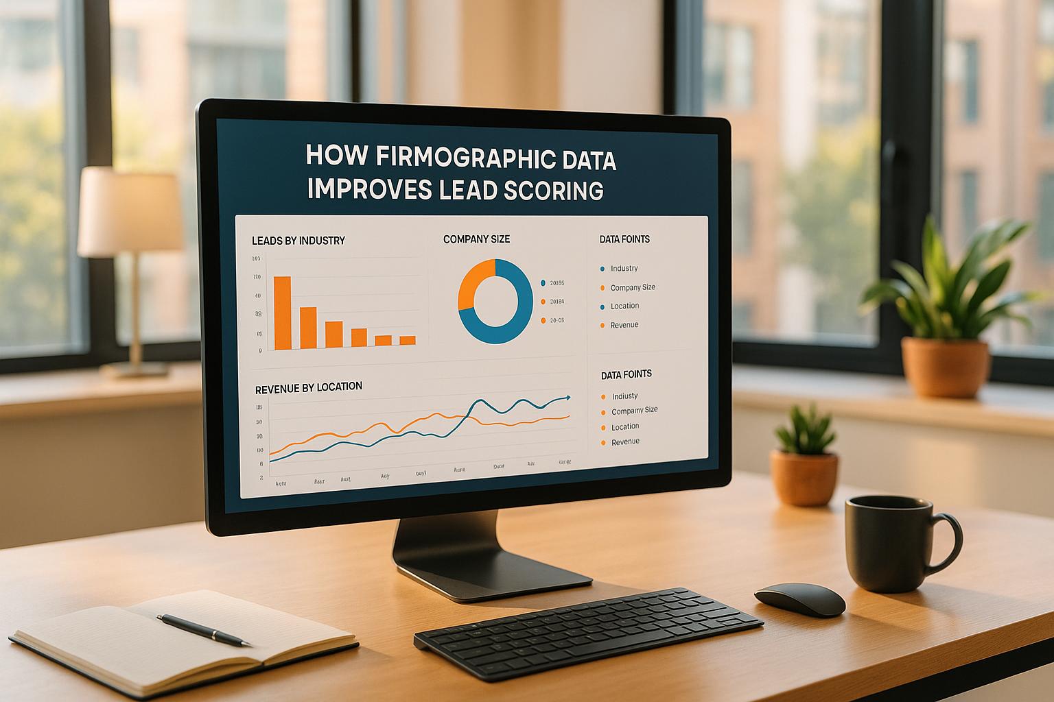
Tracking specific metrics at each funnel stage - like website traffic, lead conversion, and sales conversion rates - reveals where improvements are needed. Platforms like Amplitude, Mixpanel, and Google Analytics 4 offer advanced features to visualize and optimize these metrics effectively.
Interactive dashboards simplify decision-making by visually breaking down complex data, helping you focus on actionable steps to improve user journeys and ROI.
How to create an interactive funnel report with a bar chart from Looker Studio - Full config review

Key Metrics to Track Across Funnel Stages
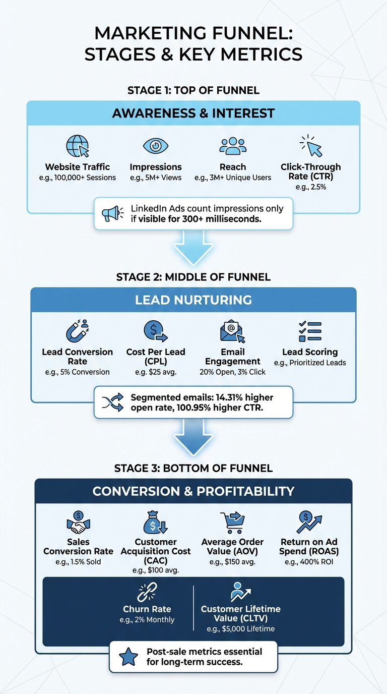
Marketing Funnel Metrics by Stage: Top, Middle, and Bottom of Funnel KPIs
A marketing funnel is made up of several stages, and each stage requires its own set of metrics to monitor. By tracking the right data at each level, you can identify what’s working and what’s not. These insights help you uncover strengths and pinpoint the leaks in your funnel. Let’s break it down stage by stage.
Top-of-Funnel Metrics
At the top of the funnel, the focus is on awareness and sparking interest. Metrics to keep an eye on include website traffic, impressions, reach, and click-through rate (CTR). These numbers give you a clear picture of how well you’re attracting and engaging your audience.
One thing to keep in mind: platforms define impressions differently. For instance, LinkedIn Ads only count an impression if it’s visible for at least 300 milliseconds. Make sure you’re comparing apples to apples when analyzing data across platforms.
Middle-of-Funnel Metrics
Once you’ve captured attention, the middle of the funnel is all about nurturing leads and building interest. Key metrics here include lead conversion rate, cost per lead (CPL), email engagement (open and click rates), and lead scoring. These numbers help you understand whether your content and campaigns are effectively moving leads closer to making a decision.
Here’s an interesting stat: segmented email campaigns outperform non-segmented ones, with a 14.31% higher open rate and a 100.95% higher click-through rate. This underscores the value of tailoring your messaging to specific audience segments.
Bottom-of-Funnel Metrics
At the bottom of the funnel, the focus shifts to closing deals and profitability. Metrics like sales conversion rate, customer acquisition cost (CAC), average order value (AOV), and return on ad spend (ROAS) are critical. These numbers show how well your strategies are turning leads into paying customers and whether your efforts are financially worthwhile.
Don’t stop tracking once the sale is made. Post-sale metrics like churn rate and customer lifetime value (CLTV) are essential for evaluating long-term success. After all, a strong conversion rate doesn’t mean much if customers don’t stick around after their first purchase.
How Interactive Data Visualization Identifies Funnel Drop-Offs
Once you've set your metrics, the next step is spotting where users are leaving the funnel. Interactive data visualization tools make this easier by providing a clear, visual breakdown of every stage in the customer journey. These tools don’t just highlight where users drop off - they also help uncover the reasons behind it.
Using Heatmaps and Conversion Paths
Visual funnel charts can map out the customer journey, revealing drop-off points like transitions from the Homepage to the Product Page, Cart, or Checkout. Heatmaps and session replays dig deeper, showing issues like overlooked calls-to-action or broken links. By tracking clicks, scrolls, and mouse movements, these tools can uncover hidden problems on a page.
Effort analysis is another valuable approach. It identifies user struggle signals, such as excessive engagement or repeated clicks. For instance, "rage clicks" often indicate a malfunctioning element on the page. Path analysis tools, like Amplitude's Pathfinder or Heap's Top Events, help visualize user behavior, highlighting common routes and unexpected drop-off paths. Comparing segments, such as mobile versus desktop users, can also reveal device-specific friction points.
Case Studies: Optimization Success Stories
Real-world examples show just how powerful these insights can be.
Take Original Grain, a watch company. They used visual heatmaps and element-level revenue data to figure out which areas of their site drove the most sales. Nate, their Marketing Lead, reorganized product placements based on revenue-per-session data. The result? A 17% boost in revenue per session and a 43% increase in site traffic.
Juan Fernandez, Head of Product at Audiense, shared how visual funnel analysis transformed their process:
"We've identified steps in our funnel that were confusing to our customers and caused them to abandon our product. We can easily identify screens that make them get lost and hesitate on what to do next, so then we can fix UX issues and continuously improve. Every small improvement increases conversions around 10 to 20 percent, which is really significant."
The results speak for themselves. Visual funnel analysis can pinpoint the root causes of drop-offs with over 95% accuracy - far surpassing the 60–70% accuracy of traditional aggregate analytics. Many businesses see a 15–40% jump in conversion rates within 60 days of addressing these issues. Considering the average cart abandonment rate is 70.19%, and around 17% of this is due to checkout complexity, fixing these friction points can make a huge difference in funnel performance.
sbb-itb-a84ebc4
Best Practices for Creating Interactive Funnel Visualizations
Designing Clear and Simple Visuals
Creating effective funnel visualizations starts with thoughtful design choices. Keep your funnel stages concise - ideally between 4 and 6. As Anastasiia L., Project Manager and Looker Studio Expert at Brights, explains:
The magic number is 4–6 stages. Any more, and your team stops paying attention, and with less, you might miss critical drop-off points.
Each stage should display three key details: the stage name, the total number of users, and the conversion rate. Combining these metrics - like "5,000 users (25% conversion)" - provides a fuller understanding of both volume and efficiency.
Stick to bar-style funnels rather than triangular ones. Bar-style visuals ensure the widths accurately represent the data, avoiding distortions, especially in early drop-offs. Arrange the stages from top to bottom in chronological order to reflect the natural progression of the funnel.
To enhance interactivity, include tooltips. These allow users to hover over a stage and get detailed insights without cluttering the main visualization. If your funnel is part of a mobile dashboard, double-check that tooltips remain easy to read on smaller screens.
Once the visuals are clear and functional, you can tailor them to align with your brand identity.
Customizing Visualizations for Your Brand
Brand consistency is key when customizing funnel visuals. Stick to uniform metrics, fonts, and color schemes to make your visualizations instantly recognizable.
Choose a color scheme that balances clarity and accessibility. You can either use varying shades of a single color or assign distinct colors to each stage. Just ensure the contrast is enough for readability without exaggerating small differences.
To explain unexpected spikes or dips, add annotations (e.g., "Black Friday campaign"). This kind of context helps clarify anomalies in the data. Additionally, custom filters can fine-tune your visuals to highlight specific campaigns or tests.
For more advanced branding options, tools like RedNavel or Databloo can be game-changers. These third-party plugins offer features like customizable color palettes, drop-off annotations, and polished presentation styles that go beyond the capabilities of native tools. Such enhancements are especially useful when presenting data to stakeholders who expect professional, on-brand visuals.
Tools and Resources for Interactive Funnel Visualization
Platforms for Interactive Funnel Analysis
Today's analytics platforms have evolved to track every click, form submission, and micro-interaction through event-based analysis. Take Amplitude as an example. Its "Conversion Drivers" feature pinpoints actions between funnel steps that are linked to higher conversion rates. Plus, it lets you run A/B tests directly within the funnel view to refine your approach.
Mixpanel takes a different angle, allowing you to track event sequences within specific time frames. It offers multiple visualization styles, including Steps, Line, and Bar charts, and simplifies recurring analyses by saving user behavior patterns for future use.
With Google Analytics 4, you get "Funnel Exploration", which supports up to 10 steps, toggles between open and closed funnels, and includes a "Show elapsed time" feature to uncover hesitation points.
For more advanced needs, Adobe Customer Journey Analytics offers forked funnels, letting you compare two journeys side-by-side. It supports up to three segments and 10 steps, providing a nuanced look at user behavior. Meanwhile, Looker Studio delivers diverse visualization options like smoothed bars, stepped bars, and inverted triangles. Its cross-filtering capabilities allow you to quickly assess the impact of specific dimensions, such as mobile usage.
These tools aren't just theoretical - they deliver measurable results. In 2025, Patreon used Amplitude to refine its pledge flow. By testing a "blurred posts" feature that hid content until users subscribed, they pinpointed a friction point that led to more than doubling their pledge conversions. As Carolyn Feibleman, Principal Product Manager at Amplitude, emphasizes:
If you're not conducting a website funnel analysis, you're throwing money away. People are leaving your website without converting, and if you don't know where or why, you can't do anything to fix it.
Using the Marketing Funnels Directory
With so many advanced analytics platforms available, choosing the right one can feel overwhelming. That’s where the Marketing Funnels Directory (https://topmarketingfunnels.com) comes in. This resource acts as a one-stop shop for businesses aiming to optimize their conversion paths. Instead of spending endless hours researching tools, you’ll find curated listings of specialized software, vendor comparisons, and even courses on mastering sales funnels - all neatly categorized by funnel type. Whether your focus is on social media, paid ads, content marketing, or B2B journeys, this directory simplifies the search.
But it doesn’t stop at tools. The directory also features books on sales and marketing strategies that complement your funnel visualization efforts. By having all these vetted resources in one place, you can save time and accelerate your path to improved conversions.
Conclusion
Interactive data visualization opens the door to a deeper understanding of your funnel's performance and customer behavior. As Lina Rafi from Choto.co explains:
When data turns visual, insight turns actionable - and that's where marketing performance truly scales.
With interactive dashboards, you're no longer stuck in passive observation. Instead, you can dive into dynamic problem-solving. These tools make it easy to zoom in on specific segments, compare time periods side-by-side, and follow user journeys through your funnel in just a few clicks. This speed and clarity help teams quickly pinpoint bottlenecks and experiment with solutions.
The data backs this up. By focusing on a streamlined funnel, you can identify critical drop-offs without getting lost in unnecessary complexity. Pairing behavioral data from GA4 with CRM metrics gives you a full picture of your revenue flow, while prioritizing conversion rates reveals overlooked opportunities for improvement.
The takeaway is clear: effective visualizations shine a light on friction points and guide smarter optimization efforts.
If you're ready to break free from spreadsheets and static charts, the Marketing Funnels Directory is a great place to start. It offers a curated collection of tools, courses, and books tailored to different funnel types - whether you're working on social media campaigns, paid ads, content marketing, or B2B strategies. These vetted resources help you cut through the clutter and drive better results.
Ultimately, interactive visualization simplifies every stage of your funnel. It highlights where users succeed and where they struggle, ensuring you're not just collecting data but truly understanding it.
FAQs
How does interactive data visualization help identify where users drop off in my funnel?
Interactive data visualization simplifies identifying where users drop out of your funnel by offering clear, visual insights into each step. It helps spotlight stages with high drop-off rates, allowing you to quickly identify problem areas and take specific actions to improve results.
For instance, you might observe a noticeable drop-off during the checkout process. Using interactive tools, you can dive deeper into the data to uncover possible issues - like unclear navigation or surprise fees - and make the necessary changes to keep users progressing smoothly.
What are the best practices for creating effective funnel visualizations?
To create impactful funnel visualizations, begin by clearly defining each stage of your funnel and using visual cues - like bars of different sizes - to show user volumes. This approach makes it easier to identify where users are dropping off or where bottlenecks occur. Opting for the right chart type, such as a funnel chart, ensures conversion rates and user flow are presented in a clear and digestible way.
Keep the design straightforward and free of unnecessary clutter to emphasize the key metrics. Adding interactive elements, like filters or drill-down options, can help users dive deeper into the data. Including annotations or benchmarks adds context, making it easier for stakeholders to interpret the information accurately. Above all, prioritize data accuracy and consistency to build trust and enable smarter decision-making.
What are the best tools for creating interactive funnel visualizations?
Interactive funnel visualizations are a game-changer when it comes to analyzing your marketing performance. Here are some standout tools to consider:
- Zoho Analytics: With its drag-and-drop interface, this tool makes it easy to create dynamic funnel charts that highlight specific stages and details of your data.
- Infogram: A platform designed for simplicity, it allows you to craft visually appealing funnel charts that effectively track data progression.
- Google Looker Studio: Perfect for mapping how metrics shift across sequential events, making it especially useful for dissecting marketing or sales funnels.
- Power BI: Offers robust funnel chart features, enabling you to visualize linear processes and gain deeper insights into each stage.
These tools make it easier to create actionable visualizations, helping you better understand your funnel metrics and refine your marketing strategies.