Want to improve your website’s performance? Heatmaps and funnels are two tools you need to understand. Together, they reveal how users interact with your site and where they drop off in their journey. Here’s the deal:
- Heatmaps: Show where users click, scroll, and focus attention on specific pages.
- Funnels: Map out the steps users take toward conversion, highlighting where they leave.
By combining these tools, you can pinpoint problems - like hard-to-find buttons or confusing forms - and make data-driven changes to boost conversions. For example, if a funnel shows a 50% drop-off at checkout, heatmaps can reveal if users are missing the “Submit” button or struggling with form fields.
Why it matters: Even a small conversion rate improvement (e.g., 0.5%) can lead to significant revenue gains, especially for businesses running paid campaigns. Platforms now integrate heatmaps, funnels, and session replays, making it easier to identify and fix issues.
This article breaks down how heatmaps and funnels work, their pros and cons, and how to use them together for better results.
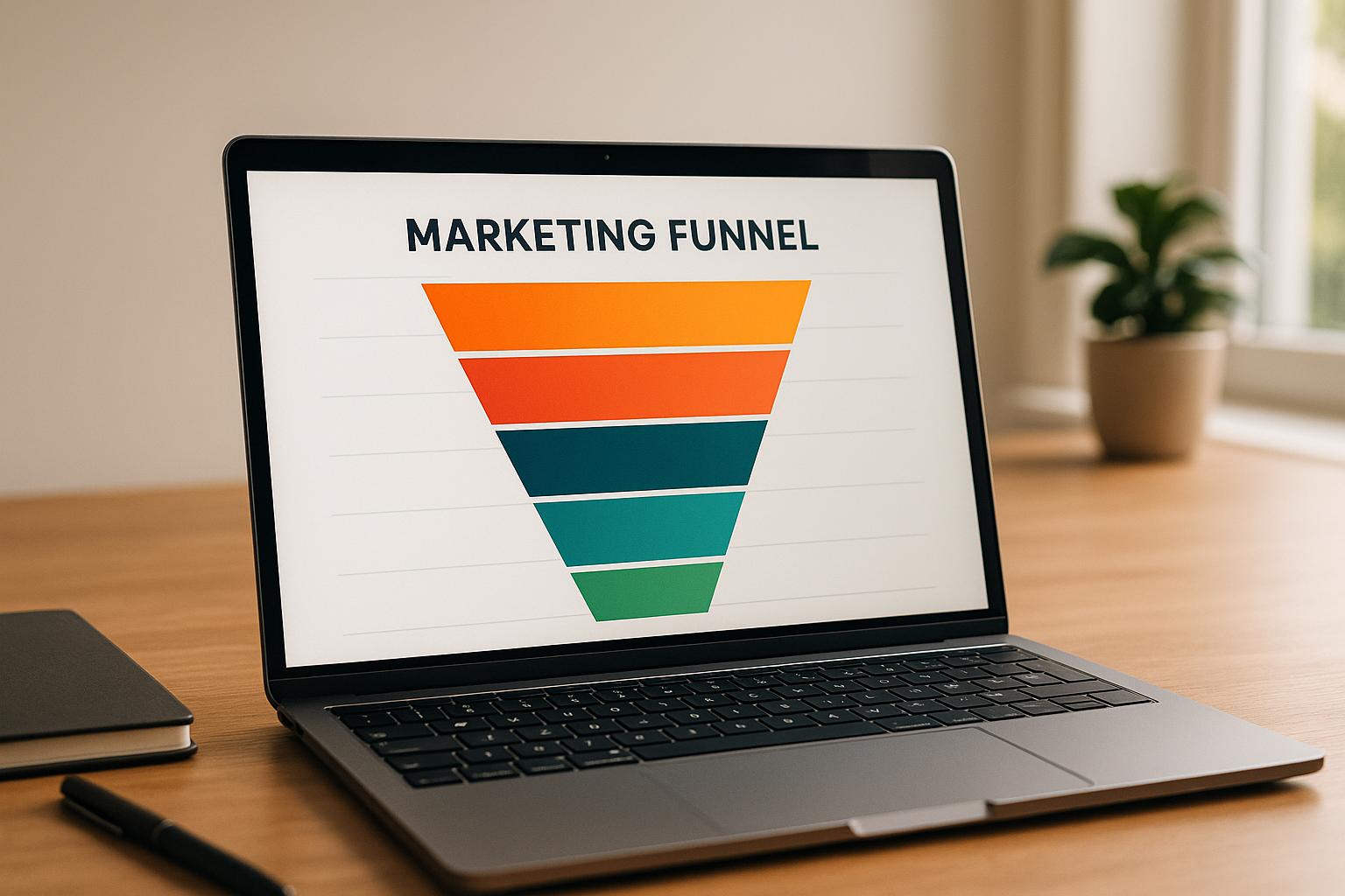
1. Heatmaps
Visualization of User Behavior
Heatmaps turn raw data into easy-to-understand visual representations, showing where users click, scroll, and focus their attention. Instead of wading through endless spreadsheets, you get a clear picture: areas with high engagement light up in warm colors, while low interaction zones appear cooler.
There are three main types of heatmaps that help analyze user behavior:
- Click heatmaps: Highlight where users engage with clickable elements, like call-to-action buttons, and where they mistakenly click on non-interactive parts.
- Scroll heatmaps: Show how far visitors scroll, helping you see if critical content like pricing or testimonials is actually being viewed.
- Move heatmaps: Track cursor movement, giving insight into where users’ visual attention is focused.
Tools like Hotjar combine these heatmaps with session recordings and feedback polls, offering a complete window into user behavior. These visuals provide an essential foundation for digging deeper into what’s working (and what’s not) in your marketing funnels.
Insights into Conversion Flows
Heatmaps go beyond the numbers to explain why users behave the way they do in your funnels. While analytics might show a drop-off at a specific stage, heatmaps help uncover the reasons behind it. For instance, are users overlooking key details? Are they clicking on non-interactive elements out of confusion?
Patterns often emerge based on where visitors come from. For example:
- Visitors from social media ads tend to scan pages in an F-pattern.
- Those clicking through targeted emails often jump straight to the sections referenced in the email.
If your page layout doesn’t match these behaviors, heatmaps will expose the disconnect. For instance, if there’s a big drop-off between starting and submitting a form, heatmaps can reveal whether users are confused by a field, missing the "Submit" button, or getting distracted by other links. Based on this, you might test changes like enlarging mobile buttons, emphasizing pricing details, or adding trust signals like badges to encourage completion.
Optimization Opportunities
Heatmaps are great for spotting common usability issues. For example, users might mistake non-clickable elements for links, or key conversion elements - like product images or feature descriptions - might be buried too far down the page. Fixing these issues can make your site more intuitive and reduce frustration.
Scroll heatmaps, in particular, can highlight if important content like pricing tables or testimonials is being missed because it’s too low on the page. Moving these elements higher could immediately increase engagement and conversions.
By understanding how users interact with individual pages, heatmaps provide actionable insights to refine your overall funnel strategy. For more structured guidance, tools like the Marketing Funnels Directory offer curated resources to help you craft customer journeys that seamlessly guide users from their first interaction to purchase - all while integrating these visual insights.
Next, let’s explore how funnel tracking works hand-in-hand with heatmaps to create a complete picture of user behavior.
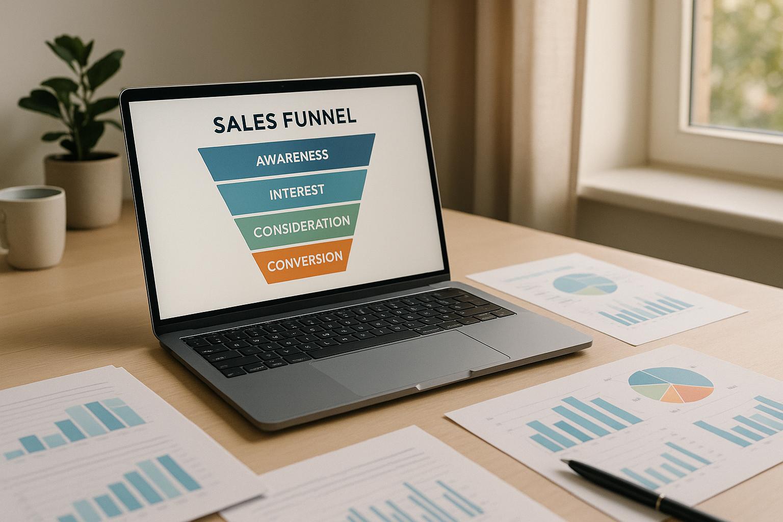
2. Funnels
Understanding User Behavior Through Funnels
Funnels provide a clear, step-by-step view of how users navigate your landing pages toward a conversion goal. Unlike heatmaps, which focus on single-page actions, funnels map the entire journey. For instance, a typical funnel might look like this: ad click → landing page view → form start → form submission → purchase.
These reports are incredibly useful because they quantify each step. They show how many users enter each stage, the percentage that drop off, and the overall conversion rate. For example, if you notice a 50% drop-off between form start and form submission, you know exactly where potential customers are slipping away.
Funnels also let you break down behavior by device, traffic source, and audience. For ecommerce, a common funnel could include steps like product view → add to cart → checkout initiation → shipping details → payment → confirmation. Each step highlights potential friction points. If 30% of users add items to their cart but only 40% of those complete the checkout, you're left with an overall conversion rate of 12%. That’s a clear signal to refine your checkout process for better results.
Gaining Insights into Conversion Challenges
Beyond mapping user journeys, funnel analytics help uncover the reasons behind drop-offs. They can pinpoint the areas where users face obstacles, such as unclear pricing, overly complicated forms, or technical glitches.
For example, funnel data might show that traffic from LinkedIn ads converts at a 15% trial sign-up rate compared to 6% from Facebook ads, even though Facebook brings in more clicks at a lower cost per click. This insight tells you where to focus your ad spend for better results.
Time-to-complete metrics add another layer of understanding. If users are spending five minutes on a checkout page that should only take 90 seconds, something’s clearly wrong. Often, mobile users take longer, which could mean your mobile experience needs improvement.
Funnel data can also reveal differences in lead quality. For example, a B2B company might find that webinar registrants from targeted email lists convert to sales-qualified leads at 25%, while broader LinkedIn campaigns only convert at 8%. Armed with this knowledge, you can refine your targeting and adjust follow-up strategies to improve outcomes.
Turning Data into Actionable Improvements
Combining funnel metrics with heatmap data gives you a clearer picture of both where and why users drop off. For instance, if a funnel shows a sharp drop-off at a particular step, heatmaps might reveal users aren’t scrolling far enough to see your call-to-action or are clicking on non-interactive elements.
Start by mapping out the ideal user flow and tracking each step. Segment your results by traffic source, device, and audience to identify patterns. Then, review your funnel data weekly to find the weakest points. If, for example, the shipping page has the highest drop-off, you could test changes like reducing required fields, adding trust badges, or offering a guest checkout option.
Let’s look at an example: a U.S. ecommerce brand might start with a 30% add-to-cart rate and a 40% checkout completion rate, resulting in an overall funnel conversion rate of 12%. By simplifying the shipping form, they could increase the shipping-to-payment conversion rate from 60% to 75%. This improvement could boost their overall funnel conversion to 15%, adding thousands of dollars in monthly revenue without increasing ad spend.
Different types of funnels require tailored strategies. For lead generation, the focus is on form completion and lead quality, tracking steps like ad click → landing page → form start → submission → sales-qualified lead. SaaS funnels, on the other hand, prioritize sign-ups and activation, while ecommerce funnels focus on the path from product discovery to payment. Creating separate funnels for each acquisition channel - whether it’s Google Ads, email, or organic social - lets you compare performance and reallocate your budget effectively.
Key metrics to monitor include step-by-step conversion rates, overall funnel conversion rates, cost per acquisition (CPA), revenue per visitor (RPV), and return on ad spend (ROAS), all measured in U.S. dollars. For example, a healthy funnel might convert at 5%, with a $25 CPA and $80 RPV. Instead of aiming for arbitrary targets, focus on incremental improvements. Even moving from a 2% to a 3–4% funnel conversion rate can significantly impact your revenue.
Watch out for common mistakes, like optimizing for vanity metrics (e.g., clicks) without considering downstream revenue or lead quality. Avoid overreacting to small sample sizes, and make sure your funnel steps are clearly defined and consistently tracked. Account for seasonality and campaign changes when evaluating tests, and always pair quantitative insights with qualitative data, such as session replays or user feedback.
For more tools and resources to refine your strategy, check out the Marketing Funnels Directory.
[NEW!] How to Create a Funnel with Microsoft Clarity
sbb-itb-a84ebc4
Pros and Cons
Heatmaps and funnels each bring their own strengths and weaknesses to the table. Knowing how they complement each other can help you better understand visitor behavior and improve your landing pages and conversion paths.
Heatmaps provide a clear visual snapshot of user behavior. They show where users click, how far they scroll, and which elements grab their attention. This makes it easier to identify issues like poorly placed calls-to-action (CTAs) or sections that visitors rarely see. For instance, if scroll maps reveal that 75% of users reach mid-page but only 35% make it to your pricing section, you might need to rethink where that information is placed.
However, heatmaps are mostly qualitative. They can be misleading if traffic is low or if you don’t segment data by device type or traffic source. A "hot spot" identified in a small sample might vanish when more data is collected. Plus, heatmaps don’t explain why users behave a certain way, so relying solely on them for design changes can be risky.
Funnels, on the other hand, excel at quantifying conversion paths. They track how many users move through each step - from clicking an ad to completing a purchase - making it easy to pinpoint where drop-offs happen. They also provide concrete before-and-after metrics when testing changes. For example, if 30% of users add items to their cart but only 40% of those proceed to checkout, you’re looking at a 12% overall conversion rate and a clear sign of potential checkout issues.
But funnels aren’t perfect either. They require precise setup, and misconfigured events can lead to misleading results. Funnels can show where users drop off but not why. Additionally, overly narrow definitions might miss non-linear user paths, while overly broad ones might lack actionable insights.
| Aspect | Heatmaps | Funnels |
|---|---|---|
| Primary Strength | Visualizes clicks, scrolls, and mouse movements; easy to interpret | Tracks step-by-step conversion paths with clear metrics |
| Best Use Cases | Spotting layout issues, misplaced CTAs, and content engagement | Measuring drop-offs in multi-step flows like checkout or sign-ups |
| Key Limitation | Qualitative insights; doesn’t explain user behavior; less reliable with low traffic | Shows drop-offs but not user actions or challenges; requires careful setup |
| Setup Complexity | Quick and easy to deploy across pages | Requires more time and deliberate event configuration |
| Data Type | Visual patterns and engagement hotspots | Hard numbers tied to conversion rates and business KPIs |
| Segmentation | Filters by device, traffic source, and campaign | Allows segmentation for performance comparisons across channels |
Using both tools together provides a fuller picture. Funnels identify the stages where users drop off, while heatmaps show what users do on those pages - whether they’re ignoring a key CTA, struggling with confusing elements, or not scrolling far enough to see critical content. Many platforms now integrate heatmaps, funnels, and session replays, letting you dig deeper into problematic steps and diagnose user experience (UX) issues more efficiently.
For businesses in the U.S. running paid search or social ads, funnels are especially valuable early on. They connect ad spend directly to conversion stages, helping you see where campaigns might be wasting budget. Once key drop-off points are identified, heatmaps can fine-tune the layout, messaging, and user experience on those pages to improve metrics like cost per acquisition and return on ad spend.
Avoid common pitfalls. Running heatmaps on low-traffic pages or failing to segment data (e.g., mixing paid and organic traffic) can blur insights. Focus on high-value pages like landing pages or checkout steps, ensure a robust sample size, and always segment by device type, traffic source, and campaign.
For funnels, avoid defining steps too broadly (e.g., "site visit" to "purchase") or too narrowly (e.g., dozens of micro-steps). Both extremes can make reports either too vague or too cluttered. Align funnel steps with meaningful business goals like "trial started" or "checkout completed" to keep your analysis actionable.
Neither tool tells the whole story on its own. Heatmaps might lead to changes that increase engagement but don’t improve conversions, while funnels alone leave you guessing about the reasons behind drop-offs. Combining these tools - and supplementing them with session replays or direct user feedback - gives you both the "where" and the "why" needed to optimize user flows effectively.
For teams aiming to go beyond surface-level tweaks, curated resources can help streamline implementation. The Marketing Funnels Directory offers tools, training, and services that integrate funnels, heatmaps, and other analytics into a single platform, alongside specialized courses for improving social, content, or B2B funnels.
Conclusion
Funnels help you measure where users drop off, while heatmaps show the specific actions - or inactions - behind those numbers. For example, a funnel report might reveal that 30% of visitors leave between your landing page and checkout, but it won't tell you if they missed the call-to-action or got stuck on a form buried below the fold. Heatmaps bridge this gap by showing what users clicked, how far they scrolled, and which elements caught their attention. Together, these tools don’t just pinpoint friction - they help you take actionable steps to improve.
Combining funnels and heatmaps makes landing page optimization a clear, repeatable process. Start small: define a funnel, such as ad click → landing page → form submission → thank-you page, and track drop-off rates at each stage. Then, use heatmaps to analyze the page with the highest drop-off. If you find that your checkout button is below the fold for most laptop users or that visitors are clicking non-interactive elements, you’ve identified clear areas for improvement. Adjust the layout - move the button higher, simplify the form, or clarify shipping costs - and then re-run your funnel and heatmaps to measure the impact. This method works whether you’re running a small business or managing analytics for a larger team.
For smaller U.S. businesses, focus on optimizing a few key pages and steps in the customer journey. Larger teams can go deeper, segmenting funnels and running continuous experiments to find new opportunities for growth. Start by addressing common friction points like misplaced calls-to-action, cluttered layouts, or overly complicated forms before diving into advanced tools.
Think of user-flow analysis as an ongoing process, not a one-time task. User behavior evolves with new campaigns, seasonal trends, and changing devices. Reviewing your funnels and heatmaps regularly - monthly or quarterly - ensures you stay ahead of these shifts. This approach helps you make steady improvements in engagement and conversion rates over time. Just remember: while funnels and heatmaps reveal where users struggle, they can’t fix issues like weak offers, poor traffic sources, or mismatched messaging.
To scale your efforts, curated resources can make a big difference. The Marketing Funnels Directory is a great starting point, offering tools, training, and services that integrate funnels and heatmaps into a single platform. It also includes specialized courses for optimizing social media, content marketing, or B2B funnels. Whether you’re refining paid ad flows, social media journeys, or multi-step nurturing campaigns, having access to vetted software and educational content keeps your strategy aligned with your broader goals - and focused on what truly drives conversions.
FAQs
How can I use heatmaps and funnels together to boost my website's conversion rates?
Combining heatmaps with funnels offers a smart way to dig into user behavior and boost conversion rates. Heatmaps give you a visual breakdown of where users click, scroll, or linger on your site, while funnels map out the steps users take to reach a goal - like completing a purchase or signing up for a newsletter.
Heatmaps can reveal trouble spots, like areas where users lose interest or get stuck. When paired with funnel data, you can pinpoint exactly where users drop off in the process. For instance, if a heatmap shows users clicking on elements that aren’t clickable, it might be a sign to tweak your design for better navigation. Or, if your funnel data highlights a significant drop-off on a form page, you could simplify the form or adjust its layout to make it more user-friendly.
Using these tools together gives you practical insights to fine-tune your website’s experience, helping guide visitors toward completing the actions you want them to take.
What mistakes should I avoid when using heatmaps and funnels to analyze user flows?
When working with heatmaps and funnels to analyze user flow, there are a few traps you’ll want to steer clear of. First up, don’t base decisions on incomplete data. While heatmaps and funnels give you a glimpse into user behavior, they’re just one part of the story. Pair them with other metrics to get a fuller understanding of what’s happening.
Another key point: segmentation matters. Treating all users as one homogenous group can lead to skewed or shallow insights. Instead, break users into segments based on things like device type, location, or specific behaviors. This approach can reveal patterns and opportunities you might otherwise miss.
Finally, don’t read too much into every result. A high drop-off in a funnel, for instance, doesn’t automatically mean there’s a problem. It might just be a natural part of how users navigate your site. Always back up your findings with further testing or user feedback to ensure your tweaks actually make sense.
How often should I review and update my heatmaps and funnels to keep them effective for analyzing user behavior?
To keep your heatmaps and funnels working as they should, it's important to revisit and tweak them regularly. For websites or campaigns with heavy traffic, a monthly check-in is ideal. For smaller-scale projects, reviewing them every quarter might be enough.
Focus on key performance indicators (KPIs) like conversion rates and points where users drop off. Use this data to fine-tune your funnels or adjust heatmap settings. Regular updates ensure you're staying in sync with shifting user behavior and that your landing pages keep delivering strong results.