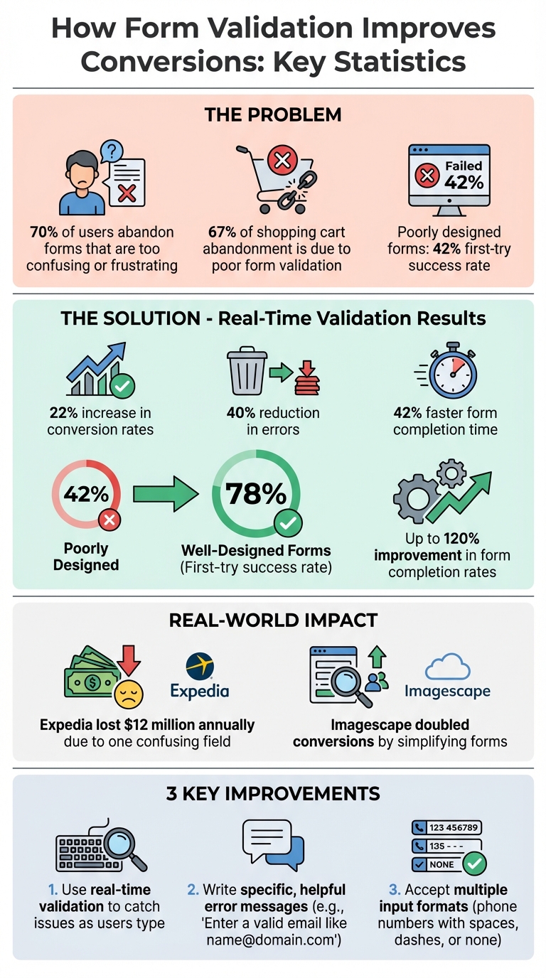
Forms are often the first step to gaining customers, whether you're collecting leads, processing payments, or onboarding users. However, nearly 70% of users abandon forms when they’re too confusing or frustrating. Poor validation - like unclear error messages or strict input rules - can drive users away, costing businesses both conversions and revenue.
Effective form validation solves this by:
- Providing real-time feedback to prevent errors before submission.
- Using clear, actionable error messages to guide users.
- Allowing flexible input formats to reduce frustration (e.g., phone numbers with or without dashes).
The results? Inline validation can boost conversion rates by 22%, reduce errors by 40%, and cut form completion time by 42%. For example, Expedia lost $12 million annually due to a single confusing field, while simplifying forms helped Imagescape double their conversions.
To improve your forms:
- Use real-time validation to catch issues as users type.
- Write specific, helpful error messages (e.g., “Enter a valid email like name@domain.com”).
- Accept multiple input formats (e.g., phone numbers with spaces, dashes, or none).
When done right, well-designed forms achieve a 78% first-try success rate, compared to just 42% for poorly designed ones. This not only keeps users engaged but also increases your bottom line.
Form Validation Impact on Conversion Rates: Key Statistics
Episode 123: Handling Form Errors and Validation with Alun Lucas
Why Bad Form Validation Hurts Conversions
When users encounter issues with your form, they don’t stick around to solve the problem - they leave. Poor form validation is a major culprit behind 67% of all shopping cart abandonment. Vague instructions and unclear error messages make forms harder to complete, increasing frustration and driving users away.
How User Frustration Reduces Conversion Rates
Forms that validate input on every keystroke disrupt users' natural flow, creating unnecessary interruptions. Similarly, hiding formatting requirements - like password complexity or phone number syntax - until after submission forces users into a frustrating cycle of trial and error.
Take Netgear's password reset form as an example: users were unaware of password requirements until they encountered error messages, leading to repeated failed attempts. Another instance is the Transportation Security Administration (TSA), where a "Clear Form" button was placed dangerously close to input fields. Many users accidentally erased their data, abandoning the form out of sheer frustration.
"Usability problems on forms really hurt business." - Kathryn Whitenton, UX Specialist, Nielsen Norman Group
When error messages are only shown after hitting "Submit", users are forced to scroll back through the form to locate and fix mistakes. This process is far more aggravating than receiving immediate, real-time feedback. These usability issues often stem from poor implementation choices and can seriously damage conversion rates.
Common Validation Mistakes
Certain validation mistakes can make or break your form's success. For instance, placing reset buttons too close to the "Submit" button often leads to accidental data deletion, causing users to abandon the form entirely. Another common issue is relying on placeholder text as field labels. Once users start typing, the placeholder text disappears, leaving them guessing what the field requires.
Strict formatting rules - like requiring parentheses for phone numbers or dashes for credit card numbers - add unnecessary complexity and disrupt the user’s flow. Error messages such as "Invalid input" or "Database error" offer no meaningful guidance, leaving users feeling blamed for mistakes they don’t understand. Repeated errors often signal deeper interface problems rather than user mistakes.
A better approach is to use forgiving formats that accept multiple input styles. For example, phone numbers should work with or without spaces, credit card numbers with or without dashes, and dates in various formats. This flexibility allows the software to adapt to the user, not the other way around.
"Confusion is the arch-enemy of conversion. If you don't want to risk a sky-rocketing drop-out rate, create validation that eliminates any risk of your customers being confused." - Marcin Treder, CEO, UXPin
How to Implement Effective Form Validation
Creating a smooth user experience is key when implementing form validation. The success of a form often hinges on how feedback is delivered, how errors are communicated, and how flexible the form is with user input. Let’s dive into some strategies that can turn a frustrating form into one that users can navigate with ease.
Use Real-Time Inline Validation
Real-time inline validation provides immediate feedback as users interact with form fields, catching errors while the input is still fresh. For instance, instead of waiting until a form is submitted, error messages can appear after a user finishes typing in a field (onblur). Once users start typing again, keystroke-level validation can kick in to guide corrections in real time.
A great example comes from REI in January 2024, where entering only two digits for a Visa security code triggered an error, which resolved itself as soon as the third digit was entered. This kind of validation speeds up form completion by 22% compared to submit-time checks and results in a 78% success rate on the first try. Even better, well-executed inline validation can boost overall form completion rates by up to 120%.
But don’t stop at highlighting mistakes - celebrate successes too. Best Buy, for example, uses "Positive Inline Validation" during account creation. Their password strength indicator and confirmation messages (like when passwords match) help users feel confident and track their progress. This combination of error prevention and positive feedback builds trust and keeps users engaged.
Write Clear and Helpful Error Messages
Nobody likes vague error messages like "Invalid input" or "Database error." These don’t tell users what went wrong or how to fix it. Instead, error messages should be specific, polite, and easy to understand. Let’s look at some examples:
| Bad Message | Good Message |
|---|---|
| "Invalid input" | "Please enter a valid email address (e.g., name@domain.com)" |
| "Requirements not met" | "Password must be at least 8 characters and include one number" |
| "Email taken" | "This email is already registered. Would you like to [Log In]?" |
"Error messages should be explicit, human-readable, polite, precise, and give constructive advice."
For example, Twitter provides immediate feedback when a duplicate email is entered. It even includes helpful links to log in or recover an account. Additionally, placing error messages directly next to the relevant field reduces user confusion. For accessibility, mark invalid fields with aria-invalid="true" and link error messages to fields using aria-describedby.
Accept Multiple Input Formats
Rigid input requirements can frustrate users. For example, forcing someone to include parentheses in a phone number or specific separators in a credit card number adds unnecessary friction. Instead, forms should accept a variety of input formats and handle conversions behind the scenes.
For instance, phone numbers should work whether they include spaces, dashes, or no separators at all. Similarly, dates should be accepted in formats like "01/15/2026", "1-15-26", or "January 15 2026". This flexibility reduces errors and makes the form feel intuitive.
On mobile devices, using input types like type="tel" for phone numbers or type="email" for email addresses ensures the correct keyboard pops up, helping users avoid typos and complete forms more quickly. By making input as easy and forgiving as possible, you can significantly improve the user experience and boost completion rates.
sbb-itb-a84ebc4
How to Measure Form Validation Impact on Conversions
Once you've refined your form validation strategies, the next step is measuring their impact. Without data, you're essentially working in the dark when it comes to optimizing conversions.
Calculate Form Conversion Rates
To gauge your form’s performance, start by calculating the conversion rate. Divide the number of successful submissions by the total number of page visitors, then multiply by 100. For example, if 500 people visit your form and 25 complete it, your conversion rate is 5%.
Dig deeper by tracking field-level abandonment to pinpoint where users are dropping off. Also, monitor how long it takes users to complete the form. If certain fields take significantly longer, it could signal confusion or struggles with validation errors. Use this data to identify weak spots, then validate your findings with A/B testing.
A/B Test Validation Changes
A/B testing is a powerful way to measure the impact of your validation updates. Create two versions of your form and split your traffic between them. For example, you could test inline validation against post-submit validation or compare a strict phone number format to one that accepts multiple formats.
Focus on one variable at a time. If you change multiple elements - like error messages, validation timing, and field order - all at once, it’ll be impossible to know which adjustment made the difference. Let your test run long enough to reach statistical significance. Acting on incomplete data could lead to misguided decisions. Research shows that forms adhering to usability best practices achieve a 78% one-try submission rate, compared to just 42% for forms that don’t. Detailed analytics can further refine your approach by uncovering hidden user pain points.
Use Analytics to Find Problem Areas
Analytics tools like session replays and heatmaps can shed light on why users struggle with your form. Look for frustration signals such as rage clicks (repeated clicks in the same spot) or dead clicks (clicks that yield no response). These behaviors might point to broken validation scripts or an unresponsive submit button.
To dive even deeper, set up custom events in Google Analytics to track each time a validation error occurs. This helps you identify which errors are most common and which fields cause the most issues. Armed with this information, you can tackle the most problematic areas first, making immediate improvements to your form’s performance.
Resources for Better Funnel Performance
Once you've fine-tuned your form validation and tracked its impact, tapping into specialized resources can take your funnel's performance to the next level.
To improve form validation effectively, having access to the right tools and guidance is key. The Marketing Funnels Directory serves as a hub of platforms, vendors, and courses designed to help businesses streamline their marketing funnels, including strategies for better form validation.
How the Marketing Funnels Directory Supports Form Optimization
This directory connects you with analytics tools like Zuko, which can track specific behaviors such as field-level abandonment and looping patterns. These insights help identify where validation issues are causing users to drop off. Similarly, tools like Fullstory provide session replays to highlight user frustrations, such as rage clicks or dead clicks, offering a clear picture of where forms are falling short.
For those looking to simplify the form-building process, the directory features no-code platforms like involve.me. These tools offer drag-and-drop interfaces with pre-optimized templates and built-in real-time validation, helping users complete forms more quickly and easily. Pre-optimized templates can directly improve your conversion rates without requiring extensive development work.
The directory also includes A/B testing platforms like Optimizely and Convert, which allow you to experiment with different validation methods. For example, you can test inline validation against post-submit validation or compare strict input formats with more flexible ones. As Craig Sullivan, CEO of Optimise or Die, points out, data-driven testing is far more effective than relying on the "HiPPO" (Highest Paid Person's Opinion) approach.
Beyond software, the directory offers access to courses on sales funnel strategies and books that focus on best practices for form design. Whether you're looking for UX audit services to measure your forms against industry benchmarks or tools to ensure compliance with WCAG accessibility standards, the Marketing Funnels Directory provides a centralized resource for proven solutions that enhance form validation and boost conversion rates.
Incorporating these tools and strategies into your funnel optimization efforts can significantly improve user experience and drive better results.
Conclusion
Form validation plays a critical role in driving conversions and directly impacts your bottom line. When users receive clear, real-time feedback while filling out forms, they complete them more quickly, make fewer mistakes, and feel less frustrated. In fact, real-time inline validation has been shown to increase conversion rates by 22%, reduce errors by the same percentage, and speed up completion times by 22–42%. Well-designed forms see a 78% success rate on the first try, compared to just 42% for poorly designed ones.
The numbers tell a compelling story. Poorly designed forms are responsible for 67% of shopping cart abandonment, and nearly 70% of users abandon forms they find too difficult to complete. On the flip side, following best practices in form design can improve completion rates by as much as 120%. As Kathryn Whitenton from Nielsen Norman Group succinctly states:
"Usability problems on forms really hurt business."
So, what’s the next step? Effective form validation requires a thoughtful combination of real-time inline feedback, clear and actionable error messages, and flexible input formats. These elements work together to reduce user friction and build trust. Tools like the Marketing Funnels Directory simplify this process by connecting you with analytics platforms to pinpoint problem areas, A/B testing tools to confirm your improvements, and courses that teach tried-and-true form design strategies.
FAQs
How does real-time form validation improve the user experience and boost conversions?
Real-time form validation makes filling out forms much smoother by giving instant feedback as users type. For instance, if someone enters an email address or phone number incorrectly - like leaving out a character or using the wrong format - the system can flag the issue right away. This helps prevent users from submitting forms with errors and avoids the frustration of finding mistakes after hitting "submit."
By making the process easier and more user-friendly, real-time validation doesn’t just improve the experience - it can also boost conversion rates. When forms are simple and error-free, users are more likely to complete them, which is a big win for marketers aiming to improve their funnels and achieve better outcomes.
What are the biggest mistakes to avoid with form validation?
When it comes to form validation, certain mistakes can seriously impact user experience and hurt conversions. Here are a few common pitfalls to watch out for:
- Relying solely on client-side validation: If you only validate inputs in the browser, you're leaving the door open for users with disabled scripts or malicious intent to bypass it. Always back up client-side validation with server-side checks to ensure both security and accessibility.
- Mistimed feedback: Validation that kicks in too early or leaves error messages hanging around after corrections can annoy users. A better approach? Wait until users finish typing, then provide instant, clear feedback - like a green checkmark - to confirm when inputs are correct.
- Unclear or overly strict error messages: Messages like "Invalid input" don't help anyone. Instead, use simple, friendly language to explain the problem and how to fix it. Be flexible with valid variations, such as international phone numbers or alternative email formats.
Fixing these common issues can lead to a smoother user experience, fewer abandoned forms, and better conversion rates.
How does form validation help increase conversion rates, and how can I measure its impact?
Form validation plays a key role in boosting conversions by minimizing errors, creating a seamless user experience, and earning visitors' trust. To gauge its impact, start by noting your form's baseline conversion rate - this is the percentage of users who successfully complete the form within a specific timeframe. Once you've introduced validation features like inline or real-time checks, compare the updated conversion rate to the original to measure the improvement.
For a more detailed analysis, try A/B testing. Design two versions of your form - one with validation and one without - while keeping everything else consistent. Then, compare metrics such as conversion rates, form abandonment rates, and successful submission rates. This method helps pinpoint the exact influence of validation.
You can also dive deeper by studying user behavior to uncover friction points. Monitor how often users encounter errors, identify which fields are problematic, and track how many attempts it takes for users to complete the form. By combining these observations, you'll get a clearer picture of how validation smooths the process and drives better results.