If I map engagement by stage, I can see where growth stalls instead of staring at disconnected metrics. The article’s core point is simple: track the funnel in order - Reach → Attention → Engagement → Clicks/Return Visits → Leads → Retention - and measure both volume and rate at each step.
Here’s the short version:
- Reach tells me if the right people saw the content
- Attention tells me if they stayed long enough to care
- Engagement shows whether they interacted in a meaningful way
- Clicks and return visits show intent beyond a passive view
- Lead actions show whether traffic turns into pipeline
- Retention shows whether the first conversion leads to repeat use or repeat revenue
The article also makes one point that matters more than anything else: a big top-of-funnel number means very little if the next stage does not move. For example:
- High impressions + low watch rate = weak hook or poor audience fit
- High engagement + low click-through = CTA problem
- High clicks + low lead rate = landing-page friction
- High lead volume + low qualified lead rate = low-fit traffic
- First conversion + no return behavior = weak retention
I’d use this kind of map to answer one question: where is the leak? Then I’d fix the largest drop first instead of trying to improve every metric at once.
A few metrics do most of the work:
- CTR =
(Clicks ÷ Impressions) × 100 - Lead conversion rate =
(Leads ÷ Visitors) × 100 - Return visit rate =
(Returning Users ÷ Total Users) × 100 - Form completion rate =
(Submissions ÷ Form Starts) × 100 - LTV:CAC =
LTV ÷ CAC
The article also points to a few benchmark-style checks:
- Bounce rate at 60%+ can point to poor intent match or page issues
- landing-page conversion under 1.2% can signal a weak lead stage
- B2B content conversion often falls in the 1% to 5% range
- Instant booking can beat standard forms - 66.7% vs. 30% meeting rate
Bottom line: I’d read the funnel top to bottom, compare each handoff, and look for the first stage where the rate drops harder than expected. That is usually where the fix should start.
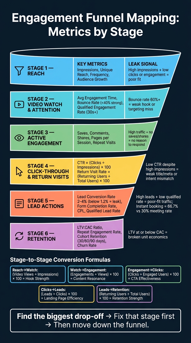
Engagement Funnel Mapping: 6 Stages, Key Metrics & Leak Signals
How to Read an Engagement Funnel Map
Read the funnel from top to bottom: visibility first, retention last. Each stage pushes into the next one, so a weak spot near the top drags down everything below it.
Funnel Stages in Order
The six stages follow a fixed path: Reach → Video Watch and Attention → Active Engagement → Click-Through and Return Visits → Lead Actions → Retention.
Here’s the simple way to think about it. Reach tells you how many people you got in front of. Video watch and attention tell you whether they stayed long enough to take in the message. Active engagement covers likes, comments, saves, and shares - signs that the content felt worth reacting to or passing along. Click-through and return visits show who left the platform and who came back later. Lead actions count the conversions that matter to the business. Retention tracks who sticks around after that first conversion.
Each stage works like a checkpoint. If reach falls, fewer people make it to watch time, engagement, clicks, leads, and retention.
Volume Metrics vs. Rate Metrics
Every stage gives you two kinds of numbers. Volume metrics are raw counts, like total impressions, views, clicks, and leads. They answer one basic question: how many. Rate metrics are percentages or ratios, like engagement rate, CTR, conversion rate, and return visit rate. They show efficiency.
This distinction matters. High volume with a low rate means you have scale, but not much efficiency. High rate with low volume means the content works, but only on a small audience. You need both views at once to find the leak. Volume shows scale. Rate shows efficiency. Conversion rates show where the drop starts.
Stage-to-Stage Conversion Metrics
Stage-to-stage conversion metrics show where the funnel leaks. The table below turns each handoff into a formula you can use to spot friction.
| Movement | Formula | What It Reveals |
|---|---|---|
| Reach → Watch | (Video Views ÷ Total Impressions) x 100 | Hook strength |
| Watch → Active Engagement | (Engagements ÷ Total Views) x 100 | Content resonance |
| Active Engagement → Click-Through | (Clicks ÷ Engaged Users) x 100 | CTA effectiveness |
| Click-Through → Lead Actions | (Leads ÷ Total Clicks) x 100 | Landing-page efficiency |
| Lead Actions → Retention | (Returning Users ÷ Total Users) x 100 | Retention strength |
With the map in place, the next step is figuring out which metric group is leaking and selecting the right marketing funnel software to fix it.
sbb-itb-a84ebc4
1. Reach
Reach measures how many of the right people see your content. The main metrics here are impressions, unique reach, frequency, and audience growth. Impressions show how many times your content appears across search, social, and video platforms. Unique reach shows how many distinct people saw it. Frequency shows how often the same people see your content, which helps you spot overexposure. Audience growth tracks new contacts entering the funnel from channels like SEO, LinkedIn, and cold outreach. At this stage, the main question is simple: did the right people see it?
Fit matters more than raw volume. More volume by itself doesn't tell you much. If reach looks high but nothing happens after that, that's usually a sign of poor fit. So don't chase impressions for their own sake. Focus on impressions that come from people who match your audience.
The table below shows what strong reach looks like and what points to a leak.
| Metric | Strong Signal | Leak Indicator |
|---|---|---|
| Impressions | Growing visibility across multiple channels | High volume with no clicks or engagement |
| Unique Reach | A steady influx of new visitors who fit your target audience | High impressions with low unique reach, suggesting over-saturation |
| Frequency | Consistent exposure without overexposure | Rising frequency without more clicks or actions |
| CTR to Next Stage | Clicks moving audiences toward watch or engagement | High impressions with no downstream click activity |
| Audience Growth | New ICP-fit contacts entering the funnel | High volume with poor ICP fit |
Before you judge reach, filter by industry, company size, and job title. Otherwise, the numbers can look good on paper while missing the people you want. If reach checks out, the next step is to see whether people keep watching.
2. Video Watch and Attention
Once reach starts landing, this stage tells you if the content can hold attention. Casual awareness turns into watch time. The main signals here are average engagement time, bounce rate, and qualified engagement.
In GA4, set up a qualified_engagement event for users who watch 30+ seconds. Use this formula:
Attention Rate = (Users who triggered qualified_engagement ÷ Total Video Visitors) × 100
Short-form social video is good for awareness. Long-form explainers and webinars do more of the heavy lifting when you need trust. And search-based YouTube video often brings in higher-intent viewers than scroll-based social video. That split matters. It helps you figure out where the leak is coming from - the hook, the format, or the traffic source.
If viewers drop off in the first 5 seconds, that usually points to a weak hook, a generic value proposition, or targeting that misses user intent. Use average engagement time instead of session duration because it measures active interaction. In practice, leaks tend to show up as high bounce rates or low average engagement time.
The table below maps common symptoms to likely causes.
| Metric | Strong Performance | Leak Indicator | Likely Issue |
|---|---|---|---|
| Qualified Engagement Rate (30s+) | At or above your target threshold | Below your target threshold | Creative or title-body mismatch |
| Bounce Rate | Below 40% | 60% or higher | Targeting or page speed |
| Average Engagement Time | High and sustained | Low or falling | Weak hook or poor content structure |
| Video Completion Rate | High and consistent | Low or dropping | Hook, pacing, or format mismatch |
If attention holds, the next step is active engagement: likes, comments, saves, and shares.
3. Active Engagement
Active engagement starts when viewers do something you can see. Think saves, comments, likes, shares, deeper page views, and repeat visits. At this stage, actions matter more than impressions. These signals help you tell the difference between casual visitors and people who may be moving toward a decision.
Pages per session and social shares are the clearest signs here. Repeat visits to pricing or service pages, plus multiple resource downloads, can point to growing intent. The table below helps show where engagement stops turning into action.
The main leak at this stage is traffic without action. If people spend time on the page but don't save, comment, or share, the content likely isn't giving them a strong enough reason to respond. To deepen engagement, use case studies, comparison guides, whitepapers, and webinars or leverage an all-in-one platform like Systeme.io to manage these assets.
| Leak Indicator | Likely Cause | Fix |
|---|---|---|
| High traffic / high bounce rate | Message mismatch or low immediate relevance | Align headlines with user intent and improve above-the-fold clarity |
If interaction gets deeper, the next checkpoint is click-through and return visits.
4. Click-Through and Return Visits
After saves, comments, and shares, the next step is simple: do people click, and do they come back?
CTR measures how often someone clicks after seeing your link, search result, or ad. The formula is straightforward: (Clicks ÷ Impressions) × 100. Pages that rank higher usually get more clicks. So if rankings look strong but CTR stays low, the problem often sits in the title, meta description, or keyword targeting - the page isn’t matching intent well enough.
Return visit rate is calculated as (Returning Users ÷ Total Users) × 100. This metric points to evaluation. When someone comes back, it usually means they’re weighing your offer, checking details again, or moving a bit closer to action. Returning users also tend to convert more easily than first-time visitors.
Here’s how weak numbers usually show up in practice:
| Metric | Leak Indicator | Likely Cause |
|---|---|---|
| CTR | Low despite high impressions | Weak title/meta or targeting |
| Return Visit Rate | Low or declining | Low utility, weak recall, or weak proof |
If clicks and return visits go up, the next thing to track is whether they lead to actual lead actions.
5. Lead Actions
Clicks and return visits only matter if they turn into lead actions. This is the point where interest becomes measurable - through form fills, booked meetings, and qualified leads. The core question is simple: does that attention turn into a contact, a meeting, or a sales-ready prospect?
Four metrics do most of the heavy lifting here. Lead conversion rate - (Total Leads ÷ Total Visitors) × 100 - shows how well traffic turns into prospects. Form completion rate - (Submissions ÷ Form Starts) × 100 - helps you spot friction inside the form. Cost per lead (CPL) - (Total Marketing Spend ÷ Total Leads Generated) - shows whether acquisition cost is staying in line. Qualified lead rate - (Qualified Leads ÷ Total Leads) × 100 - tells you whether those leads have actual commercial fit.
Speed matters more than most teams think. Instant booking lifts meeting rates to 66.7%, versus 30% for standard forms. That gap is hard to ignore. Tools like Calendly or Chili Piper can cut the drop-off that happens when follow-up lags.
A high lead count paired with a low sales-qualified lead rate is a bad trade. It usually points to poor fit or weak qualification. In plain terms, the offer may be pulling in the wrong audience, or the traffic source may be low quality.
| Metric | Strong Performance | Leak Indicator |
|---|---|---|
| Lead Conversion Rate | 2%–4% (landing pages) | Below 1.2% |
| Form Completion Rate | High and consistent | Low or dropping |
| CPL | Stable or declining | Rising without lead quality gains |
| Qualified Lead Rate | Above target threshold | Low relative to total leads |
If lead quality holds, the next place to check is whether those customers come back.
6. Retention
Conversion isn't the finish line. After someone takes that first lead action, retention tells you whether that moment turns into repeat business - or whether the user disappears. At this stage, the question changes from "Did they convert?" to "Did they come back?"
Use return visit rate to check whether users come back after converting. Track LTV:CAC to see whether that retention makes financial sense. If LTV stays well above CAC, the funnel is doing its job. If not, the unit economics can fall apart fast.
Repeat engagement rate shows the share of customers who take a second meaningful action after the first conversion, such as a renewal, purchase, or feature adoption.
Track cohorts at 30, 60, and 90 days to spot where drop-off begins. It also helps to mark the first-value moment and measure retention from that event.
| Metric | Formula | Leak Indicator |
|---|---|---|
| Return Visit Rate | (Returning Users ÷ Total Users) × 100 | Low rate suggests content lacks utility or reference value |
| LTV:CAC Ratio | LTV ÷ CAC | LTV at or below CAC |
| Repeat Engagement Rate | Second meaningful action ÷ Initial conversions | Users convert once but do not come back |
| Cohort Retention | Active Users in Period N ÷ Starting Cohort | Sharp drop-off before the 30-day mark |
| Churn Rate | % of users who stopped engaging or canceled | Rising churn without a clear cause |
Look at which content pages drive the highest return visit rates, then add specific nurturing CTAs on those pages. None of this works without clean GA4 data, CRM data, and cohort reporting.
Tables for Diagnosing Funnel Leaks
Use these tables to spot where the funnel starts losing steam.
Reach, Impressions, and Frequency
Start at the top and work down. The first mismatch usually tells you where the problem begins.
| Metric | Mismatch Signal |
|---|---|
| Reach | High reach + low engagement = poor targeting or content that misses the mark |
| Impressions | High impressions + low reach = over-saturation |
| Frequency | Rising frequency with flat conversion = creative fatigue |
Watch Time and Completion Rate
These two metrics show whether people are leaning in - or dropping off.
| Metric | Reveals About Attention | Diagnostic Value | Leak Signal |
|---|---|---|---|
| Watch Time | Depth of interest | High time = sustained value | Low time = weak hook or intro failed to grab attention |
| Completion Rate | Content structure success | High % = compelling, well-paced flow | High time + low completion = mid-video drop-off |
Saves, Comments, and Likes
Saves matter most here because they suggest someone wants to come back later. That's a stronger signal than a quick like.
| Metric | Signal Strength | Intent Level | Leak Signal |
|---|---|---|---|
| Likes | Low | A light engagement signal | High likes + low saves = content is engaging but not useful long-term |
| Comments | Medium | Active engagement | Low comments = content doesn't spark conversation or opinion |
| Saves | High | Utility/reference intent | High likes + low saves = content lacks practical, lasting value |
CTR, Landing-Page Engagement, and Return Visit Rate
A strong CTR paired with weak landing-page engagement usually means the promise got the click, but the page didn't back it up. For context, B2B search positions 1-3 typically see a 10-30% CTR, while positions 4-10 see 3-10%.
| Metric | Focus Area | Intent Type | Leak Signal |
|---|---|---|---|
| CTR | Ad or title appeal | Initial curiosity | Low CTR = weak headline or meta description |
| Landing-Page Engagement | Content relevance | Active exploration | High CTR + low LP engagement = clickbait or title-body mismatch |
| Return Visit Rate | Brand trust | Nurturing potential | Low return rate = one-off utility; no reason to stay connected |
Lead Conversion Rate and CPL
Read these together, not in isolation. A high conversion rate with a high CPL means the channel can produce leads, but the cost makes scaling tough. B2B content conversion rates usually land between 1-5%.
| Metric | Type | How to Read Together |
|---|---|---|
| Lead Conversion Rate | Efficiency | High CVR + high CPL = quality channel, but expensive to scale |
| CPL (Cost Per Lead) | Cost | Low CPL + low CVR = cheap traffic that won't convert |
Retention Metrics Side by Side
This table helps you match the metric to the question in front of you. Not every retention metric tells the same story.
| Metric | When to Use | Leak Signal |
|---|---|---|
| Return Visit Rate | Measuring content authority and stickiness | Low rate = content isn't a reference source |
| DAU/MAU | Daily-use apps or products | Declining ratio = loss of daily relevance |
| Churn Rate | Identifying post-purchase dissatisfaction | Rising churn = gap between marketing promise and product reality |
| Repeat Purchase Rate | Measuring loyalty and LTV | Low rate = poor post-purchase experience or no upsell path |
Tools for Measuring Engagement Funnel Performance
Analytics and Attribution Tools
Use your stack to measure each stage with a clear job in mind: reach, attention, engagement, clicks, leads, and retention. The goal isn't more dashboards. The goal is to know what happened at each step and tie that back to revenue.
Google Analytics 4 (GA4) should be your main measurement layer for tracking the path from first visit to closed-won revenue. Use GA4 to connect anonymous traffic to CRM outcomes, then send lifecycle events back into reporting. That way, your funnel map reflects what happens after the form fill, not just before it. Connect GA4 to your CRM so lead status changes flow back into the funnel map.
Use BigQuery for unsampled cohort analysis and CRM joins. Then pair it with Looker Studio for stakeholder dashboards.
For acquisition metrics, native analytics in Meta, LinkedIn, and Google Ads do a good job with reach and video attention metrics. But ad platform data on its own only tells part of the story. To close the gap between ad performance and on-site behavior, send those signals into GA4 with tools like Meta CAPI or Google Ads offline conversion imports.
Funnel Planning and Vendor Research
Once the tracking stack is set, pick tools that fit your reporting and attribution needs. For vendor research, use Marketing Funnels Directory, a curated list of funnel tools and RevOps vendors for teams aligning funnel data with pipeline reporting.
Conclusion
Once you map stage metrics and leak points, the takeaway is straightforward: the full sequence - Reach → Video Watch and Attention → Active Engagement → Click-Through and Return Visits → Lead Actions → Retention - gives you a clear way to spot where people stop moving forward.
Track both volume and rate metrics at each stage. Volume shows scale. Rate shows efficiency. That split helps you decide where to fix the funnel first.
If traffic is high but conversion is low, improve CVR before chasing more volume.
Start with the stage showing the biggest drop-off against your benchmarks, fix that leak, then move to the next. That is the value of the map: find the biggest leak, fix it, then move down the funnel.
FAQs
Which funnel stage should I fix first?
Start with the stage that has the highest drop-off rate. If you fix the biggest bottleneck first, you’ll usually get the biggest lift in overall performance - even from small tweaks.
Focus on micro-conversions that connect to your main business goals, not vanity metrics that look nice but don’t move the needle. Funnel charts make this easier to spot because they show exactly where prospects lose interest or leave.
How do I know if a drop-off is normal or a leak?
Compare the drop-off against your past benchmarks, stage conversion rates, and user behavior. It’s a leak when it goes beyond normal patterns or shows up as an unusual deviation.
Use funnel charts or Sankey diagrams to spot where users exit. Then check for:
- technical or UX issues
- unclear messaging
- buyer inactivity
- stage aging beyond the usual timeframe
What tools do I need to measure the full funnel?
Use analytics tools that can track events, map user paths, and connect with your CRM. Google Analytics 4 handles web event tracking and funnel exploration. Mixpanel and Amplitude go deeper on user behavior. Hotjar adds heatmaps and session recordings, which helps show why people drop off.
For video engagement, use YouTube Studio, Vimeo, or TikTok analytics. Keep your event names consistent across tools, and connect your CRM so you can follow the path from first touch to closed-won revenue.